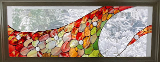
This is part 3 of a series about my designs for stained glass window panels.
Part 3: The hummingbird feathers panel (this post)
I started design work on my third transom window panel even before the second panel had been delivered. My goal was something dog-related. The initial mockup was intended to depict a wagging tail in a triptych-like design:
A friend remarked that it looked like a pineapple. Sigh.Abandoning the canine connection, I played around with variations on a couple of shapes that came to me unbidden:
The exercise was interesting, and I think designs 1 and 2 show promise, but I didn't like them well enough to pursue. I set them aside and returned to the dog theme. My approach this time was to build on trajectories of bouncing balls. (Dogs like to fetch them.) The mathematics of such trajectories avoided the need for me to do any drawing, though you'll note a terrible depiction of a Chuckit! ball launcher at the left in design 6:
Casting about for a different course, I considered encoding a dog-related message in a geometric version of Morse code. That led to designs such as this (which I believe depicts "Good Dog", although I don't remember exactly how):
I set the the dog idea aside again and turned my attention to the Rufous hummingbirds that frequent the feeder near the window the panel was destined for. As you can see in this photograph from audubon.org, the throat feathers on the males are striking:
I mocked up a conceptual design:I approached some stained glass artists about fleshing out the design and making the panel. I also asked about the possibility of incorporating iridescent and/or dichroic glass, because I thought that would be visually interesting and could help convey the dazzling effect the feathers can produce. I inquired about incorporating prisms into the design, too, because I thought it would be fun to have light spectra scattered on the walls near the panel.
I chose a local artist, Sondra Radcliffe of Ambiente Art Glass, to advance my design from concept to reality. Visiting her workshop was a revelation. I selected the glass for my first two panels from manufacturers' online catalogs, but Ambiente Art Glass uses only hand-blown glass for their panels, and they've spent decades curating a collection of unique glass pieces for their projects. It's beautiful and remarkable stuff--colors of various levels of translucence layered on top of one another to produce 3D effects within a sheet of glass. Even the clear pieces show character, e.g., cracks, bubbles, and slight distortions. The glass in my third panel is in a vastly more sophisticated league than those that came before it.
We ultimately decided against iridescent and dichroic glass, but Sondra incorporated a number of beveled glass jewels. They scatter light when the sun shines through them. She took my idea of a hummingbird throat and reinterpreted it as a wave. This is the panel she created:A close-up makes it easier to appreciate the glass's complexity, as well as the skill with which Sondra selected, cut, and arranged the pieces:Alas, the panel isn't as successful as I'd hoped. It's my fault. I made two serious mistakes. First, I failed to consider the view through the window when I used clear glass in the design. I'd imagined the colored glass against a white background (as in my conceptual mockup), but the view through the window is largely of trees. That makes it harder to appreciate the colors in the panel. It looks best after a snowfall:
My second error was failing to realize that the window is too high and the deck ceiling too wide to allow sunlight to directly reach the panel. That means the prismatic effect I'd hoped for from the glass jewels doesn't occur.I'm still happy with the panel. It's a big artistic step up from the panels that preceded it, and it has the attractive property that the closer you examine it, the better it looks. The big takeaway, however, was that when designing a panel, you have to take into account where it will be and what will be visible behind it. You can't design a stained glass panel in isolation. I took that lesson to heart in the design of my next panel.


No comments:
Post a Comment