Friday, December 30, 2022

Anne Frank's Diary: Versions, Translations, and Ownership, Oh My!

This is a follow-up to my previous post about reading Anne Frank's famous diary.

In an entry for October 1942, Anne Frank reports that no one had warned the people in hiding that someone would come to fill the fire extinguishers. In the German translation I read, the beginning of the sentence is worded this way (after translation into English via DeepL Translator):

Because they are so clever downstairs, they didn't warn us...

My German's not bad, but I'm far from fluent, so as I read the diary, I checked my comprehension using the published English translation. There, the sentence fragment reads like this:

The office staff stupidly forgot to warn us...

This bothered me. The sarcasm in the German is missing in the English. That greatly affects the tone of the diary entry. A diary is a very personal thing. I wanted to hear Anne's voice as I read it. Did she express her annoyance using the sarcasm in the German, or did she simply employ the deprecating wording of the English? My money was on sarcasm from a young teen, but I wanted to know for sure. At least one of those translations had to be wrong!

This question sent me down the rabbit hole of diary versions, translation inconsistencies, and ownership rights for Anne Frank's diary. It's an interesting story, if you're into that kind of thing. If you're not, I'll cut to the chase. It looks like neither the German nor the English translations convey the tone present in the Dutch that Anne wrote in.

Update 6 January 2023: As noted below, it's now clear that sarcasm is present in the Dutch, so the German translation is correct in tone, and the English translation is not.

Versions of the Diary

Anne wrote two versions of her diary:

  • Version A is her personal diary. She wrote it only for herself. The diary consisted of multiple notebooks. The one covering December 1942 to December 1943 was not recovered after Anne was arrested, so Version A is now incomplete.
  • Version B is Anne's revision of Version A, including the entries in the Version A notebook that has since been lost. Her aim was to publish Version B as a book after the war.

Her father, Otto, created

  • Version C from Anne's versions. Version C doesn't contain everything in Versions A and B, because Otto withheld some material (typically having to do with sex or Anne's feelings about her mother). He also edited the manuscript for length and, in some cases, tone. Version C was the diary published in 1947 that made Anne Frank famous.

For researchers and others with a serious interest in the versions, The Critical Edition includes complete copies of Versions A, B, and C. (It also contains other writings by Anne Frank as well as the findings of a detailed investigation into the diary that confirmed its authenticity.)

1991 saw publication of the

  • Definitive Edition, a new version based on Versions A and B that includes the material Otto withheld when preparing Version C. It's about 30% longer than Version C. The Definitive Edition is sometimes known as Version D.

In 1998, five new pages from Version B surfaced. They have since been incorporated into the Definitive Edition, resulting in what I refer to below as the Revised Definitive Edition. In 2018, two pages that had been deliberately obscured (presumably by Anne) were visualized. I don't know whether they currently are or in the future will be in the Definitive Edition.

While investigating translation discrepancies such as those discussed below, I tracked down a number of digital copies of the diary. These were generally scans of books. In some cases, publication information was missing, so I had to figure out which diary versions I was looking at. I came up with the following algorithm:

  • If the first diary entry is for 12 June 1942 and the entry for 15 October 1942 mentions refilling fire extinguishers, it's Version A.
  • If the first diary entry is for 20 June 1942, it's Version B.
  • If the first diary entry is for 14 June 1942, it's Version C.
  • If the first diary entry is for 12 June 1942 and the entry for 20 October 1942 mentions refilling fire extinguishers, it's the Definitive Edition.
  • If it's the Definitive Edition per the above and the entry for 8 February 1944 discusses Anne's parents' marriage, it's the Revised Definitive Edition.

Translation Inconsistencies

When looking at excerpts from Anne's diary entries, the academician in me wants to follow Nicholas Whyte's lead of showing both the original Dutch and the English translation. Unlike Whyte, however, I don't know Dutch, so I can't interpret what's in the original. All I can do is translate the Dutch into English (I use DeepL Translator) and look at the result. In the examples that follow, I'm assuming the DeepL-generated English accurately reflects the Dutch original. 

Since I'm showing only English translations for the Dutch, I'm also showing only English translations for the German. I'm using DeepL Translator for those, too.

Each translation from the Dutch shows the diary version I used. For the German and English, I'm always using the Revised Definitive Edition.

 15 October 1942 (Version A), 20 October 20 1942 (All Other Versions)

This is the diary entry I introduced at the beginning of this post. In the Dutch original, does Anne use the sarcasm reflected in the German translation, or does she express her annoyance through the deprecating wording in the English translation?

German: Because they are so clever downstairs, they didn't warn us...

English: The office staff stupidly forgot to warn us...

Dutch (Version A): We had not been warned...

Dutch (Version C): We knew someone was coming to fill the devices, but no one had warned us...

The answer appears to be neither. In the Dutch, Anne simply states a fact: those in hiding had not been warned. She doesn't pass judgement on this lack of warning, so why the German translator (Mirjam Pressler) added sarcasm and the English translator (Susan Massotty) added derision, I don't know. 

I find these translations disturbing. I think it's unreasonable for a translator to make gratuitous changes to the tone expressed by an author they're translating.

Update 31 December 2022: In a comment on this blog post, Unknown posted the Dutch from the Definitive Edition. Submitting that to DeepL yields this:

Dutch (Definitive Edition): Being so savvy downstairs, they didn't warn us....

That's definitely sarcasm, so the German translation retains the tone of the original, while the English translation does not. Presumably the sarcasm is present in Version B (which I don't have), and the definitive Edition decided to go with that instead of with the unsarcastic wording of Version A that appears to have been picked up for Version C.

Update 6 January 2023: I have now acquired The Critical Edition in English, so I have a translation of Version B at my disposal. It confirms my guess above:

English (Version B): Downstairs they are such geniuses...

27 September 1942

This is my favorite line in the book, because it reflects the attitude I'd expect a thirteen-year-old butting heads with her mother to adopt, especially given the "there is no escape" conditions in the secret annex.

German: Today I had another so-called "discussion" with Mother.

English: Mother and I had a so-called “discussion” today...

Dutch (Version A): Today I had a so-called "discussion" with mother...

Dutch (Version C): Had an argument with mother, for the umpteenth time lately...

When I first checked this against the Dutch, I had only Version C, and I was horrified to see that the young-teen snarkiness present in the German and English was missing from what Anne had written! It struck me as unlikely that the German and English translators had independently come up with the idea to quote "discussion" when it wasn't present in the Dutch, so I went searching for a Dutch Version A. There I found the wording I was looking for.

We know that Otto Frank created Version C from Anne's Versions A and B. We also know that Anne wrote Version A for herself, but Version B for eventual publication. In this diary entry, I'm guessing that Anne decided to tone down the attitude for the general public, and her father used the Version B wording in his Version C. 

For the Definitive Edition, it seems that the decision was made to go with the wording of Version A. (I can't confirm this, because I don't have the Definitive Edition in Dutch.) I'm glad. I prefer snarky thirteen-year-old writing-for-herself Anne over fourteen-year-old smoothing-things-over-for-the-public Anne.

15 April 1944

In several places, I noticed that the English translation made some things explicit that were implicit or ambiguous in the German. The following is a good example. I show a translation from Dutch only for Version A, because I can't find this passage in Version C.

German: Kugler is furious. He gets the blame for not having anything changed on the doors, and we do such a stupid thing!

English: Mr. Kugler’s furious. We accuse him of not doing anything to reinforce the doors, and then we do a stupid thing like this!

Dutch (Version A): Kugler is furious; he gets blamed for not having anything changed on the doors, and we pull a stunt like this!

The Dutch uses the passive voice in describing how Kugler gets blamed, and the German follows suit. Who's doing the blaming is unspecified. In the English translation, the passive is eliminated, and it's explicit that the people in hiding (Anne's "we") are the ones assigning blame. 

I was confused when I read this diary entry (in German), because I didn't remember anybody having complained about Kugler and the doors. Consulting the English clarified who'd done the complaining, but a cursory search of earlier diary entries doesn't turn up anything that explicitly supports the English interpretation. In principle, there's no reason why the complaints couldn't have been levied by members of the office staff rather than by those in hiding with Anne.

Given the sentence as a whole, I think the interpretation is probably correct ("We asked Kugler to do something, but then we turned around and did something stupid"), and it's consistent with the tensions that sometimes arose between Kugler (who helped those in hiding) and the people he helped. Nevertheless, the English translator's decision to replace the passive voice in the Dutch with an active voice has the effect of putting words in Anne Frank's mouth.

9 April 1944 (Version A), 11 April 1944 (All Other Versions)

In the following, note how the German mentions a washtub, but no books. The English mentions books, but no washtub. The Dutch Version A mentions both, and the Dutch Version C mentions neither.

German: All four of them ran upstairs, Peter opened the doors and windows of the kitchen and private office, threw the phone on the floor, and finally they all ended up in hiding, along with the wash tub.

English: All four of them raced upstairs. Dussel and Mr. van Daan snatched up Dussel’s books, Peter opened the doors and windows in the kitchen and private office, hurled the phone to the ground, and the four of them finally ended up behind the bookcase.

Dutch (Version A): All four of them ran upstairs, Pf. and v. P. took the books from the former, Peter opened the doors and windows of kitchen and private office, smashed the telephoon on the floor and with the washing up, all four had finally ended up behind the hiding walls.

Dutch (Version C): All four snuck upstairs, Peter quickly opened the doors and windows of kitchen and private office, smashed the phone on the floor and finally all four had ended up behind the hiding wall.

DeepL's translation of the Dutch Version A is somewhat stilted, so here's the result of Google Translate on the same passage:

Dutch (Version A) via Google Translate: All four ran upstairs, Pf. and v. P. took the books from the former, Peter opened the doors and windows of the kitchen and private office, threw the telephone on the floor and ended up with the washtub, all four of them had finally ended up behind the shelter walls.

The diary entry containing this passage is long, describing a tense two-day period where those in hiding fear even more than usual that they are about to be discovered. I think it could serve as the basis for a great stage play, but that's neither here nor there. 

The books mentioned in Version A play no further role in the story told by the diary entry. That's presumably why they don't appear in Version C. 

The situation as regards the washtub is more interesting. Prior to the passage we're looking at, the diary entry tells us that that the washtub is in the office kitchen. Later in the diary entry (i.e., after this passage), we're told the washtub is still there. Based on the DeepL and Google translations from the Dutch, Version A seems to say that that the washtub is taken with the four people as they leave the kitchen and enter the secret annex ("behind shelter walls"). That's a problem. How can the washtub have been removed from the kitchen, yet still be there (as we're later told it is)? Perhaps this apparent contradiction is why Version C got rid of the washtub in this passage.

Since both the German and English translations mention either the books or the washtub, their source must be Version A (presumably via the Definitive Edition, on which they're based). It's possible that the English translator kept the reference to the books, because it's in the original and doesn't cause any problems, but got rid of the reference to the washtub to avoid a later inconsistency. This would be in line with my impression that the English translator isn't averse to veering away from the Dutch in the interest of clarity.

As for the translation into German, all I can do is scratch my head. It eliminates Version A's mention of the unproblematic books, but it retains Version A's confusing mention of the washtub. That's got me stumped.

The Diary's Legal Landscape

When Anne's father, Otto, died in 1980, he left Anne's diary and other writings to the Netherlands. The NIOD Institute for War, Holocaust and Genocide Studies is currently responsible for them. NIOD has the pages Anne wrote, but it doesn't have the copyright to them. Otto left that to the Anne Frank Fonds, a Swiss foundation he established. It's a curious situation. NIOD has Anne's writings, but not the right to publish them. The Anne Frank Fonds has the right to publish them, but it doesn't have the writings themselves.

It gets curioser. The building where Anne and the others hid is owned and managed as a museum by the Anne Frank House. Thanks to a permanent loan from NIOD, Anne's original diary is displayed there. The Anne Frank House possesses the diary, then, but it owns neither it nor the copyright to what's in it. 

Copyright issues came to a head in 2016, because that was when, in principle, the copyright on Anne's writings should have expired. They sort of did, but only in some places. The situation is so convoluted, I'll just point you to this article, which gives an overview of the convolutions, and this one, which explains how new wrinkles were added to old ones.

Tuesday, December 27, 2022

Anne Frank's Diary

During a visit to Amsterdam in 2009, I toured the Anne Frank house and bought a copy of the famous diary. I knew Anne and her family were originally from Germany, so I assumed she'd written in German. I bought that version of the book, figuring I'd get the words straight out of her mouth. I later found she'd written in Dutch. Oops.

For 13 years, the book sat on my "to be read" pile. This month, I decided to take the plunge.

It's a wonderful book. Nailing down just what book it is is complicated, because there are multiple versions of the diary. In addition, different translators approach the job in different ways. I'll blog about those things separately. Here I want to focus on the content of the book.

As a preface, I'll note that the proper pronunciation for "Anne" isn't "Ann," but "Anna" (more or less). Watch interviews with people who knew her, e.g., her father and Hanneli Goslar, and you'll see what I mean. Anne Frank wrote one of the most significant books of the twentieth century. It and her fate have made her the face of the holocaust. Her name is easy to say. We should know how to say it.

The title of the English translation is "Diary of a Young Girl," and that does a good job of establishing appropriate expectations. It's not a book about the persecution of the Jews during the Nazi era. It's not a book about the holocaust. It's not a book about WWII. All those things play a role, and Anne writes about each of them. If you're looking for insights into those topics, you'll find them. But the essence of the book is the struggle of a girl in the passage from child to adult under unimaginable conditions.

Anne starts her diary on her thirteenth birthday, and what emerges is a portrait of a child who's exuberant, smart, and curious, but also strong-willed, sarcastic, and not as smart or experienced as she thinks she is. She doesn't get along with her mother. My favorite line from the book, in the entry for September 27, 1942, includes this classic teenager remark:

 Today I had a so-called "discussion" with mother...

I laughed out loud. You can almost see the eye-roll. This was far from the only place that got me laughing. Some of Anne's remarks are very, very funny.

It's good she had a sense of humor, because at the time she wrote that, it was the eighth week of sequestration for her and seven others in a hidden set of rooms in the building housing her father's business. The "secret annex" the eight of them lived in comprised only about 450 square feet. Anne's bedroom was 13 by 6 feet. She shared it with a 53-year-old man (a family friend). The windows were covered (to prevent outsiders from seeing them), so they couldn't see out. Much of the time, their single toilet could not be flushed, lest someone hear the water in the pipes. Sometimes the inhabitants of the annex could (carefully) visit other parts of the building, but the eight of them were stuck together most of the time. The men smoked constantly. If someone got on your nerves, there was no escape. If you had an argument, there was no escape. If you wanted to go somewhere and be alone, there was nowhere to go. Leaving the building was out of the question.

Try coming of age under those conditions. 

It's astonishing, then, that in a diary entry after three and a half additional months in hiding (January 13, 1943), Anne displays such empathy for the Amsterdammers on the outside:

We're quite fortunate. Luckier than millions of people. It's quiet and safe here. ... The children in this neighborhood run around in thin shirts and wooden shoes. They have no coats, no caps, no stockings and no one to help them. Gnawing on a carrot to still their hunger pangs, they walk from their cold houses through cold streets to an even colder classroom. Things have gotten so bad in Holland that hordes of children stop passersby in the streets to beg for a piece of bread.

She's still just 13, though. A few weeks later (March 10, 1943), she writes:

The guns were booming away until dawn. I still haven't gotten over my fear of planes and shooting, and I crawl into Father's bed nearly every night for comfort. I know it sounds childish, but wait till it happens to you!

Things get worse. The allies conduct air raids near Amsterdam. Anti-aircraft guns blaze. Bombs fall. It goes on for months. Anne remains terrified, but her sense of humor endures. June 2, 1944:

I ... have a brand-new prescription for gunfire jitters: When the shooting gets loud, proceed to the nearest wooden staircase. Run up and down a few times, making sure to stumble at least once. What with the scratches and the noise of running and falling, you won't even be able to hear the shooting, much less worry about it. Yours truly has put this magic formula to use, with great success!

Many of Anne's diary entries focus on how nobody really understands her and how she's always being treated unjustly. It's standard teenage angst, which is at once both unsurprising and surprising. She's a young teen, but you might think all the other things she's going through would crowd that out. They don't. 

1944 ushers in lovesick Anne. She sets her sights on literally the only boy in her world. January 6, 1944:

My longing for someone to talk to has become so unbearable that I somehow took it into my head to select Peter for this role.

Peter is more than three years older than Anne, who by that time is 14. Anne's sister, Margot, is about the same age as Peter, but Margot is quiet and reserved. Anne is anything but. Her diary entries from January through March are filled with thoughts and hopes and dreams of Peter, Peter, Peter! It gets to be a bit much. Finally on April 16, 1944, we seem to get what Anne's been waiting for:

Remember yesterday's date, since it was a red-letter day for me. Isn't it an important day for every girl when she gets her first kiss?

Check your modern sensibilities at the door. The kiss in question is on the cheek.  (Well, half on the cheek and half on the ear.) Their lips don't meet for 12 more days, and if anything more serious than that ever takes place, it's not in the diary. 

Anne wins the boy, but her ardor cools. He won't become the confidante she yearns for. July 15, 1944:

We talked about the most private  things, but we haven't yet touched upon the things closest to my heart. ... I never broach the subjects I long to bring out into the open. I forced Peter, more than he realizes, to get close to me, and now he's holding on for dear life. ... I soon realized he could never be a kindred spirit...

It's sad for both of them, but by then, lovesick Anne has given way to introspective Anne. She's wrestling with the tension between her introverted but pure, good, and serious self and the superficial, extroverted, flippant persona she displays to the world. Her final diary entry--August 1, 1944--agonizes over the problem of displacing this persona in favor of her purer, deeper self:

A voice within me is sobbing, "You see, that's what's become of you. You're surrounded by negative opinions, dismayed looks and mocking faces, people who dislike you, and all because you don't listen to the advice of your own better half." Believe me, I'd like to listen, but it doesn't work, because if I'm quiet and serious, everyone thinks I'm putting on a new act... [They] berate me for being in a bad mood, until I just can't keep it up anymore... I ... finally end up turning my heart inside out, the bad part on the outside and the good part on the inside, and keep trying to find a way to become what I'd like to be and what I could be...

That's the last paragraph in the book. It's a downbeat ending, but it's an artificial one. Anne didn't decide to stop writing. Instead, three days later, Anne and the others were discovered, arrested, and, eventually, sent to Auschwitz. By the end of the war, only Anne's father was alive.

When the diary ends, Anne is barely 15. She's grappling with weighty, adult issues (inner self vs outer self, identifying who you want to be, figuring out how to be that), but at heart, she still is and wants to be a schoolgirl. In various entries, she writes of her long-term goal to be a successful writer, but when, on June 6, 1944, the allied invasion they've been expecting for at least 16 months finally materializes, the hope she expresses is that of a student: "Maybe...I can even to back to school in September or October."

It's Anne's diary and it's her story, but eight people don't hide themselves for more than two years. Without the genuinely heroic actions of their six "helpers," there would have been no food, no clothing, no soap, no tobacco, no newspapers or magazines, no library books, no mail, no correspondence courses, and no conversations with people in the outside world. As the war drags on and resources become scarcer, the helpers find it increasingly difficult to feed eight mouths that aren't supposed to exist. The black market fills the void, but trafficking there is as illegal as hiding Jews. The diary opened my eyes to the essential and dangerous work performed by Dutch "helpers."

Anne, her family, and her other fellows-in-hiding were deported to Germany on September 3, 1944. Along with 1,011 other Jews, they were on the last train from Westerbork transit camp to Auschwitz. It's natural to wonder what would have happened to Anne and those who hid with her had they not been caught on August 4 or if they hadn't made that last train. My sense is that their prospects would not have improved much. Amsterdam remained under German control for eight more months, and the Nazis engineered a famine over the winter of 1944-45 that led to the death of more than 20,000 Netherlanders.

Anne Frank's life story is tragic and upsetting and centered on death. Her diary is quite different. It's tragic and angsty, but it's also insightful and funny, and all about life. It makes you wish you'd known Anne personally. It makes you feel a bit like you did.

Wednesday, September 28, 2022

EV Pricing: Nissan Ariya vs. Nissan Rogue

I've wanted to buy a small electric SUV with AWD since 2019. I was initially put off by the cost, but last year I realized that money was not actually the problem. The problem was that nobody was making an EV with the features I want, at least not for the United States market.

Thirteen months later, nothing has changed. You still can't buy an EV that satisfies my basic criteria: a compact SUV with AWD, an openable moonroof, a 360-degree overhead view, and an EPA-estimated range of at least 235 miles.

Nissan is supposed to start shipping the Ariya in the coming months, and it checks all the boxes. So does its gas-powered sibling, the Nissan Rogue (except for the electric part). Since they're compact SUVs from the same manufacturer, if you equip them similarly, you can ballpark how much it costs to switch from an ICE drivetrain to one based on electrons.

Nissan's Ariya (left) and Rogue (right)

The least expensive Rogue configuration that includes AWD, an openable moonroof, and a 360-degree overhead view is the SL trim. MSRP (with destination) is $36,295. 

The corresponding Ariya is the Evolve+ e-4ORCE. Its MSRP is $55,485. 

That's a difference of $19,190. The Ariya is built in Japan, so the federal EV tax credit doesn't apply, though there may be state and/or local incentives. Based on MSRPs, going from a gas-powered Rogue to a comparable battery-powered Ariya incurs a premium of about 53%. That's more than twice the 25% limit I consider reasonable.

Last year, I noted that Volvo's XC40 Recharge has AWD, an openable moonroof, and a 360-degree overhead view, but its EPA range was only 208 miles. That's since been improved to 223 miles, but it's still short of my 235 mile requirement. The forthcoming Mercedes EQB looks to tell a similar story. It's got AWD, a moonroof, and an overhead view, but estimates of its EPA range generally fail to hit the 235 mile mark.  (The EPA hasn't yet published its official range.) Both the Volvo and the Mercedes have MSRPs that exceed that of the Ariya, so they look to cost more and deliver less, at least in terms of range. 

For the fourth year in a row (since 2019!) I find myself waiting for the automobile industry to produce an electric car with the features I want for a price I'm willing to pay. I've never had much trouble finding a reasonably-priced ICE vehicle with an acceptable feature set, so I don't understand why it's so hard this time around.

Friday, August 26, 2022

More Old Magazines need New Home

Inspired by my recent magazine housecleaning, I'm also making these old technical magazines available to anybody who wants them:

  • IEEE Computer, December 2002-March 2013.
  • Communications of the ACM, January 2005-October 2012.
  • IEEE Software, November/December 2002- March/April 2013.
  • ACM Queue, June 2004-May/June 2008.

Let me know if you have any interest: smeyers@aristeia.com.


Wednesday, August 24, 2022

The Beardsley Salome Dinnerware Project, Part 1: Concept to Artwork

In 1989, my friend, Karen, invited me to an exhibition of drawings by Aubrey Beardsley at Harvard's Sackler Museum. I'd never heard of Beardsley or the Sackler Museum, but Karen was working on her Ph.D. in Art History, and I wasn't about to turn down a chance to attend an exhibition with an expert.

The Climax
The Peacock Skirt
My memory of the drawings themselves is hazy, but I clearly remember thinking that Beardsley's black-line artwork would look great on white dinner plates. The Peacock Skirt, for example, seemed like it would make a fine choice, as would The Climax

I wasn't the first to look at Beardsley's drawings and think dishes. In 1979, Poole Pottery introduced its Beardsley Collection, and for its 2020 exhibition, Tate adorned mugs and plates with Beardsley artwork. These days, you can find plates and mugs with Beardsley drawings at ifarfor, though you may want to take into account that it's in Russia before placing an order.

I've long liked the idea of custom-made dinnerware. When the Internet blew the lid off the Pandora's box of product personalization in the 2000s, I started looking for places to make dishes for me. It wasn't difficult to find companies to design and produce limited runs of tableware, but their idea of a short run was a dozen or more place settings, each with five or more pieces. Including set-up fees and minimum order requirements, total costs started at several thousand dollars. That might pencil out for a restaurant, bed and breakfast, private club, or corporate dining room, but for an individual like me? No.

I bided my time. In August, 2021, as part of a spot check into options for made-to-order dinnerware, I discovered that Enduring Images offered custom sets under attractive conditions. From artwork you supply, they create decals using ceramic toners. The decals are applied to "blanks" (i.e., dishes provided by you or by them) and fired in a kiln. The results are functionally indistinguishable from dishware you'd buy at retail. They're no more prone to scratching than mass-market tableware. If the blanks are dishwasher- and/or microwave-safe, the dishes are, too. 

This was exactly what I was looking for. I began work designing a Beardsley dinnerware set.

The Salome Challenge

Aubrey Beardsley's best-known work is probably the 16 illustrations he created for Oscar Wilde's Salome. The Peacock Skirt and The Climax are among them. However, these drawings comprise a mere drop in Beardsley's artistic bucket. His work for Thomas Mallory's Le Morte Darthur makes up several hundred images, for example, and that's still less than half of what he created before he died of tuberculosis at only 25. My initial plan was to use the drawings from Salome for my dinner plates and to select from his other works for the remainder of my set, but I became so intrigued by the Salome illustrations that I decided to use only them.

The decision was partly motivated by the challenge of pulling it off. I had decided I wanted 12 place settings, even though it's nearly inconceivable that my wife and I would host a meal with 10 other people. In addition, I wanted five serving dishes, because I had found a mix of that many platters and large bowls that I thought looked nice. Finally, I wanted every piece to be unique: each plate, bowl, and platter should have its own look. With 12 dinner plates, 12 smaller plates (for e.g., salad or dessert), 12 bowls, and five serving dishes, that necessitated 41 different designs. The fact that Beardsley produced only 16 illustrations for Salome (plus two front cover designs, one back cover design, and a spine design), well, that was part of the challenge. 

Getting the Images

It's easy to find copies of Beardsley's Salome drawings on the Internet. Quality varies, in part because some images are scans of the original drawings, while others are scans of prints made from those drawings. I wanted the best, most authoritative images I could find, so I made a digital bee-line for the Harvard Art Museums. They have nine of the 16 Salome originals.

Scans of these drawings are freely downloadable, but the resolution is terrible. The Peacock Skirt's 745 x 1024 pixels is typical. Printed at 300 dpi, which I consider the bottom of the barrel for print resolution, the image would be about 2.5" x 3.5". That's considerably smaller than I want to put on a dinner plate, much less a serving dish.

Harvard offers higher-resolution imagery, but it's subject to the Harvard Art Museums' licensing policy, which includes this restriction:

Each image must be reproduced in its entirety without cropping, bleeding, alteration, splitting, or other modification.

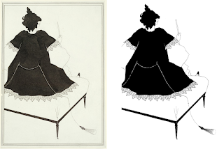
Beardsley's work for Salome used two colors: black ink and white paper. The drawings are now over 125 years old, so the inks have faded and the papers have yellowed. Compare Harvard's scan of Salome on a Settle (left) with the cleaned-up black and white version I created (right):

Salome on a Settle

I believe my version is more representative of Beardsley's work than the original has become. I'm certain it would look better on white dinnerware. However, the Harvard Art Museums' licensing provisions preclude color correction. They also prohibit removing the border present in Beardsley's drawing. That's problematic for my tableware, because I want to use the rim of a dinner plate as the frame around the drawing instead of the border that Beardsley drew.

Harvard's licensing terms surprised me, because Aubrey Beardsley died in 1898. All his drawings are in the public domain, at least in the United States. Such works are free of copyright restrictions. My understanding is that they can be used by anyone in any way.

Of course, I don't want to use Beardsley's actual drawings on my dinnerware. I want to use scans of them. Enter the lawyers. If a drawing is in the public domain, is a scan of it also in the public domain? Or is creation of the scan tantamount to creation of a new work of art that's protected by its own copyright? 

I'm not so paranoid to think that Harvard (or any other owner of a Beardsley drawing) will sic their legal team on me if I adorn dishes for my personal use with scans of their artwork. Nevertheless, I've been the beneficiary of copyright protection for the books I've written, so I try to respect the rights of others. Furthermore, I find the legal question interesting. What does it take to make a newly-created image worthy of copyright?

More than simply scanning something else, as it turns out, at least in the United States. In Bridgeman vs. Corel, the court ruled that slavish copies of two-dimensional works fail to contribute the necessary originality needed to quality for copyright protection. (The legal landscape may be different when 3D objects such as sculptures are involved.) Practically speaking, scans of 2D artworks in the public domain are themselves in the public domain. Harvard and other institutions may attempt to impose more restrictive licenses, but it's unlikely they'd survive a legal challenge.

Rather than petition Harvard for higher-resolution scans (and possibly get embroiled in a licensing dispute), I shifted my search from scans of their drawings to scans of prints made from them. Such prints are in many museums, because they were part of Wilde's book, Salome. If you have a copy of the book, you have copies of Beardsley's drawings.

In the end, most of the images I used came from the Princeton University Art Museum. When I first looked at their scans, the majority had significantly higher resolution than I was able to find elsewhere--nearly six times the resolution of those at Harvard. However, a few scans had relatively low resolution. I wrote to ask about these suspect images. Princeton confirmed the anomalies and said they'd scan again. When they posted the updated imagery a few weeks later, I was surprised to discover that they'd rescanned all the Salome prints, not just the ones with low resolution. The new resolution was nearly twice the high resolution they'd had before! Thank you, Princeton Art Museum!

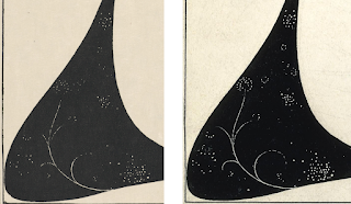
These scans had the best resolution I was able to find, but my goal wasn't maximum resolution, it was highest overall quality for use on tableware. Image resolution was only one consideration. A second consideration was whether a scan was of an original Beardsley drawing or of a print. Originals were preferred. A third was fidelity to the original. Some scans show more details than others. Consider these two versions of a portion of The Toilette of Salome II:

Detail from The Toilette of Salome II

The one on the left is from the Princeton Art Museum and is a scan of a print. The one on the right is from the British Museum and is a scan of the original drawing. The Princeton scan is at about 1100 dpi, while that of the British Museum is at only about 280 dpi, but you can see that there are more details in the scan from the British Museum. For this image, I chose the scan from the British Museum.

I ultimately availed myself of scans from the Princeton University Art Museum, the Princeton University Library, the British Museum, B at Flickr, and Alamy. I paid Alamy a small fee for use of one image. Everything else was free.  

Acquisition of the images spanned several months. Some of that time was spent in the legal cul-de-sac of usage restrictions on scans of public domain works, some elapsed as various museums took their time responding to messages I'd sent, and some ticked by as Princeton worked to post new imagery. The dominating activities, however, were searching for and downloading images, examining them for quality and authenticity (some online Beardsley images have been subtly revised), and comparing different scans of the same illustration to find the best versions.

Cleaning the Images

Most scans were of complete book pages. Beardsley's artwork didn't extend to the page edges, so I cropped off the extra space. Some scans were askew, so I straightened them. Then the fun began.

As I noted, Beardsley's drawings (and the prints made from them) are two-color works, but the inks and papers have undergone color shifts since they were created. Scanners pick up color variations, so a scan of a Beardsley drawing will typically yield an image with thousands or tens of thousands of colors. The Princeton University Library's scan of the original drawing for The Black Cape contains a full 117,000 colors. To save space, some institutions store the scans in JPG format, which, as a side effect of reducing the size of a file, may increase the number of colors in the image. 

Recreating the original appearance of a Beardsley drawing required taking images with many colors and transforming them into images with only black and white. The program I used for this (XnView MP) has an option to do just that. Check a box, and the deed is done. Applying that directly to downloaded scans didn't yield very satisfactory results. Image details got lost, and artifacts were introduced. Converting to greyscale before reducing to black and white didn't help. 

What I found worked best was to adjust attributes of the scan, primarily contrast and exposure, before checking the box to reduce the image to two colors. Each scan had to be tweaked individually to get the best results.

Drawings and prints over a hundred years old have spots, smudges, and other imperfections. Dust specks may be present during scanning. Scanners dutifully record all these things. Combined with the fact that the process of transforming colored pixels into black and white ones isn't perfect, it's no surprise that the two-color versions of scans contained errors. Some black pixels should have been white, and some white ones should have been black. I used a simple image editor (Microsoft Paint, of all things, because it's what I had) to flip the colors of such pixels.

Along the way, I fixed "mistakes" in the scanned images. I'd encounter a few black pixels on the face of a character that looked like they shouldn't be there. Or I'd find a white line in a black garment that petered out when it seemed like it should continue. When that happened, I'd consult the original scan to see what was there. If the pixels were still on the face or still faded away in the clothing, yet they still looked wrong, I'd check scans of prints from other institutions to see if they looked the same. If I could, I'd consult a scan of the original drawing. Unfortunately, the low resolution of Harvard's online scans often made answering questions about image details difficult. I spent a lot of time agonizing over pixels and staring at three monitors: one showing the black and white image I was working on, one showing the scan from which that image was derived, and one showing a different scan of the same illustration (ideally a scan of the original drawing). In cases where I wasn't sure what to do, I just made a choice and moved on. I consoled myself with the knowledge that I was working on artwork for dinner plates and cereal bowls, not retouching the Salvator Mundi.

Rework

I cleaned images of most illustrations more than once. When I first came upon the scans at the Princeton Art Museum, their resolution was so good, I stopped looking for anything better. I knew Princeton was working to address the anomalous low-resolution scans I'd reported, but I didn't realize they were rescanning all their Beardsley prints at even better resolution. By the time the new scans were online, I'd cleaned up the ones I'd already downloaded. Unwilling to leave better resolution on the table, I repeated the cleanup work on the new scans.

I eventually realized that highest resolution didn't always equal highest overall quality. I did the work to clean up the Princeton Art Museum's version of The Toilette of Salome II before recognizing that the British Museum's lower-resolution scan retained more detail. So I cleaned it up, too. Similarly, I did preliminary cleanup work on the Princeton Art Museum's scan of a print of The Black Cape before discovering that the Princeton University Library (a separate entity from the Art Museum) offered a scan of the original drawing. The drawing had authenticity on its side, so I stopped working on the scan from the print and shifted my attention to the one from the drawing. 

The Blanks

Interspersed with my work acquiring images was work acquiring the dishes to serve as blanks. I considered square and squarish shapes, with and without texture, before deciding to stick with classic untextured rimmed round plates. 

I wanted a bright white to provide good contrast with the black Beardsley drawings, and I didn't want to try to evaluate shades of white from online photos, so went to the local Bed, Bath, & Beyond (BBB) to look at what they had in stock. Their Neveah White line had a color I liked, it featured pieces in shapes and sizes I found appealing, and, being on clearance, it was attractively priced. I bought what the store had, and I ordered the remainder from BBB online. 

It was amusing to see the pieces trickle in. Oftentimes, plates and bowls arrived in sets of one and two, each from a different store. When I placed the order, I envisioned a shipment from a giant warehouse with shelves of discontinued pieces, not dribs and drabs from stores across the United States. 

Many of the pieces I received were chipped, cracked, or otherwise marred. Perhaps I should have expected that from clearance items. The local BBB took them back without fuss, but the process of ordering the pieces, waiting for them to arrive, having Enduring Images run tests to confirm that they would provide a suitable substrate for their decals, realizing that too many blanks were flawed to proceed, and returning them took several weeks.

It also put me back at Square One on the blank front. Well, almost. I had originally decided not to use the blanks offered by Enduring Images, because they didn't have serving dishes I liked. However, their other pieces were acceptable. The BBB platters and serving bowls were a reasonable color match for the Enduring Images dishware, so I went the mix and match route: plate and bowl blanks from Enduring Images, serving dish blanks from BBB.

Enduring Images' dinner plate blanks were back ordered several months. That was initially frustrating, but it turned out not to matter. A time-consuming fight with PowerPoint was building over the horizon...

Designing Dinner Plates

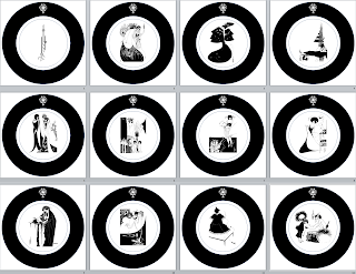
For my dinner plates, I knew I wanted a common rim design with a unique Beardsley illustration in the middle of each piece. But what rim design? I mocked up more than two dozen variations. I started with black adornments on a white rim, but I soon decided I'd remove the rectangular border present in most of Beardsley's drawings and employ a black plate rim as an ersatz frame. This simple device often disguised that I was using images designed for rectangular pages on plates that were round.

My mockups convinced me that the rim should serve two goals. First, it should act as a black frame that neither competes with nor detracts from the artwork inside. Second, it should convey that the dinnerware is based on Salome. I decided to fulfill these goals by employing a plain black band adorned with a copy of the symbol that Beardsley developed for the cover of Wilde's book.

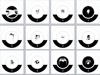
These are my dinner plate designs:

Because I'll eventually forget which drawing is on which plate, and because the academician in me loves attributions, I decided to put a decal on the underside of each plate identifying the Beardsley illustration on it and the source of the corresponding scan. For these underside decals, I added a splash of color. Beardsley worked with black ink, but everyone familiar with the publication process knew that his drawings could be printed in any color. Oscar Wilde recommended scarlet for the artwork on the book's cover. His publisher ignored this request, but in its honor, I decided to use red for Beardsley's insignia on the bottom of my pieces. This is the front and back of one of the dinner plates:

Designing Smaller Plates

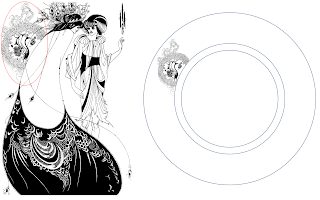
I expected the rim design for the smaller plates to go quickly, because I had an idea for it early on. Peacocks are common in Beardsley's work for Salome, and in The Peacock Skirt, there's a peacock perched on Salome's back that I thought would look great on a plate rim. Here's Beardsley's illustration and a rim mockup:

Sadly, I found that the peacock that worked well as a detail in The Peacock Skirt foundered on its own. It evoked more Dr. Seuss than Aubrey Beardsley. I returned to the drawing board.

Some 20 designs later, I had something I could live with. I again wanted a design that tied the set to Salome, but I also wanted something that would look nice stacked atop a dinner plate. For the Salome tie-in, I ended up using the S from Beardsley's lettering for the book title. This entailed considerably more work than I had anticipated. Creating a high-enough-resolution image of a single letter from a photograph of a book cover in a museum exhibition was, well, let's just say I spent a lot of time fiddling with pixels. Four times I junked what I had and started over.

For the artwork in the center of the smaller plates, I decided to focus on heads and faces. That allowed me to give prominence to details of Beardsley's drawings that are easy to gloss over when viewing his compositions as a whole. It also afforded me the opportunity to use parts of his work that hadn't made the cut for the dinner plates.

Here are my designs for the smaller plates:

I find that the black part of the rim lends the impression that some figures are floating above an invisible horizon. The effect came about by accident. The height of the black is simply the approximate height of the left side of the black background in The Climax when put on a plate. One of my experiments was to use that background as a rim design. The result didn't wow me, but it put me on the path of partially black rims, which ultimately led to the design I adopted.

Designing Bowls

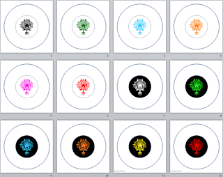
The designs for my plates feature a different image on each plate, but a fixed set of colors (black and white). For my bowls, I flipped this around. They feature a fixed image (the Salome symbol from my dinner plate rims), but each bowl employs a different color. 

Enduring Images warned me that the colors produced by ceramic toners can differ noticeably from what's displayed on a computer screen. They recommended we run a sample tile with the colors I planned to use. It was good advice. Some colors that were easily distinguishable on screen looked nearly identical on the test tile. I adjusted some color choices, we fired another sample, and we were good to go. 

Here are my bowl designs:

Designing Serving Dishes

The serving dishes consist of three platters and two bowls. The platters are rectangular. Two have about the same aspect ratio as Beardsley's drawings. I used full Beardsley illustrations for them, borders and all. One of the platters is narrower, but its shape is a good match for the depiction of Salome in the drawing for the book's list of pictures. I chopped off the rightmost two-thirds of Beardsley's illustration, and the result fit the platter perfectly. Here's Beardsley's List of the Pictures (left) and my platter design based on it (right):

Like the smaller plates, the serving bowls feature details from Beardsley drawings, but this time it's not heads or faces. One bowl (left) shows the powder brush from Cul-de-Lampe. The other (right) shows the lily sprouting from the blood of John's severed head in The Climax:

Modifying Beardsley's Artwork

I think Beardsley did fabulous work for Salome. I devoted a great deal of time to the creation of faithful two-color versions of his drawings, but that merely got me to the dishware design starting line. Beardsley targeted rectangular spaces (book pages), while I was designing for circular objects (plates or bowls). This often put us at odds. I felt no compunction about removing elements of Beardsley's pictures in the service of designs I found more attractive. A good example is my treatment of the drawing, John and Salome. On a (rectangular) serving platter (left), I used it exactly as Beardsley drew it, but on a (circular) dinner plate (right), I removed both the border and some horizontal lines:

Different renditions of John and Salome

If this puts you off, perhaps you'll feel better when I note that for dishes with modified drawings, the attributions on the undersides indicate that that is the case. 

Sins of removal are nothing compared to their artistic antipode: sins of augmentation. In some cases, I added elements to Beardsley's illustrations that he never drew! 

This should horrify you. It horrified me. Showing the truth and nothing but the truth, but not the whole truth (i.e., omitting part of an illustration) is dodgy enough. Showing things that aren't true at all is vastly worse. Yet still I put posthumous pixels on Beardsley's pen. There simply were cases where I felt that a lot of Beardsley and a little of me made more visual sense than Beardsley all by himself.  

Consider the caricature of Oscar Wilde in The Woman in the Moon. I wanted to use it as one of the faces on my smaller plates, but it's tucked into the corner of a drawing, and its rectangular shape is a bad fit for the circular region I needed to fill. So I extrapolated what Beardsley drew until I had what I desired. Compare his work (left) with what I turned it into (right):

I did more than just add ink around the edges of Beardsley's creations. One of Salome's most striking images is John's head on a platter. Setting aside why anybody would want to eat off a plate with that on it, I was determined to use it as part of  the "faces and heads" theme for my smaller plates. Unfortunately, Salome is handling the head in that illustration (The Dancer's Reward), and if you're looking only at the part of the picture showing John's head, Salome's hands are a distraction. I removed them. That left gaps in the drawing, so I filled them in. Compare Beardsley's work (left), the same thing with a first cut at removing Salome's hands (middle), and my final image (right):

Not a pixel I added is worthy of Aubrey Beardsley, but I'm happy with the result. The artistic blasphemy doesn't bother me.

PowerPoint as Hotel California

To design plates, you don't need fancy software--at least not the way I do it. If you can draw a circle and put an image in the middle, you're most of the way there. Add the ability to perform basic shape and image manipulation (e.g., crop and rotate, add and subtract shapes, set a transparency color), and you're set. PowerPoint (PPT) can do all that and, unlike proper graphics programs like Photoshop and GIMP, I had it and knew how to use it. So I did.

This was a colossal mistake. However, even in retrospect, I don't think it's one I should have foreseen. There were no hitches as I designed my pieces. It was only when I went to generate PDF for delivery to Enduring Images that I ran into trouble.

PPT directly supports the generation of PDF, but, by default, it reduces the resolution of the contained images to 200 dpi. Installing and using PDF printers bumps that up to 220. Setting the right combination of program options (some of which must be set before you save your work the first time) can push this to 300. That's it. If there's a way to go higher, I wasn't able to find it, and I spent a lot of time looking.

I'd worked very hard to acquire, clean up, and design with scans of Beardsley's artwork at at least 600 dpi. Enduring Images can print at up to 1200 dpi. I didn't want to throw such resolution away because of some ridiculous PPT limitation. It was easy to demonstrate that, once I'd enabled the proper combination of options, PowerPoint files contained the images I was using at their full resolution. It was equally easy to show that PDF had no trouble containing high-resolution images. So PPT allowed me to import high-resolution images, and it allowed me to work with them inside the program, but if I wanted to generate PDF, it insisted I settle for 300 dpi or less.

That got my hackles up. "Fine," I thought, "I'll find another way. There's more to life than PDF." I set my sights on TIFF. One program upgrade, a registry hack, and an extrapolation of said hack later, I was generating 600-dpi TIFF images of my designs and patting myself on the back. "Take that, PowerPoint!," I gloated. "I wanted 600 dpi, and I've got it!"

Let us recall the story of Tithonus, whose request for immortality was granted, but who failed to ask for eternal youth to go with it. Although he never died, he grew ever older and more infirm. Not what he had in mind. The PowerPoint parallel is that although I found a way to coax 600 dpi designs out of the program, I took fidelity for granted. Such naiveté! The TIFFs PPT created at a sparkling 600 dpi didn't contain the images I'd imported and that PPT stored. They contained modified versions of those images. In particular, they'd had anti-aliasing applied to them. This had the effect of taking my carefully-prepared, high-contrast, two-color images and softening the edges by adding colors. It undid a key part of the the cleanup work I'd performed on the scans I'd downloaded. Definitely not what I had in mind.

I couldn't help but think of the line from Hotel California: "You can check out any time you like, but you can never leave." High-resolution images can go in to PowerPoint, but once they're part of a design, they can't come back out.

My track record for getting software to do what I want is pretty good. It's generally just a matter of putting enough time and energy into it. Not in this case. PowerPoint beat me. I got to the 99½ yard line, but I couldn't get the ball into the end zone. Ten months into the project, I realized I should have gone with something like Photoshop or GIMP, after all.

When in Doubt, Farm it Out

From the perspective of a graphics professional, my designs are laughably simple. My dinner plates, for example, are just a black ring with a picture in the middle and another one on the ring. Enduring Images had explained how they would take my artwork, import it into Photoshop, and use that to print the decals. Because my designs were so simple, I suggested that Enduring Images take my high-resolution, un-anti-aliased images and my design mockups and create the final artwork directly in Photoshop. That would bypass PowerPoint and obviate the need for me to learn a real graphics program. To my relief, they agreed. 

The Ending is Pending

That's where things stand now. Enduring Images has my designs and my high-resolution artwork, and they have the blanks on which to print them. Soon they'll produce a complete dinner plate for my examination. In principle, they could run everything, but just when you think nothing could possibly go worng (not a typo--look it up), something does. Better to find out on one piece than on 41.

There may be additional bumps down the road, but I'm confident we'll get past them. Later this year, I expect to be the proud owner of what will probably be the world's only Beardsley Salome dinnerware set. It will be 33 years after Karen and I visited the Beardsley exhibition at Harvard, and it will be more than a year after I first wrote Enduring Images about custom tableware, but the key thing is that it will be. When it is, I'll post again and let you know how things turned out.


Sunday, August 21, 2022

Old Magazines need New Home

I've decided that the shelf space I currently devote to old technical magazines can be put to better use. That means the old magazines need a new home. Otherwise they'll go in the recycling bin. 

The magazines in question are Doctor Dobb's Journal from March 1996 through February 2009 and Embedded Systems Programming (later Embedded Systems Design) from March 1997 through May 2012. 

If you'd like to save some quarter-century-old magazines and their compatriots from being turned into paper fiber, let me know: smeyers@aristeia.com.


Friday, April 29, 2022

Image Search and Google Earth for Identifying Pictures

For more than 50 years, my parents used slide film to record family memories. I recently had their 1500+ slides digitally scanned, and I've been working to organize the resulting files. At the outset, the job seemed pretty straightforward. My father had carefully labeled the boxes and trays the slides were in: "High Rock 1953", for example, or "Europe 1978".

However, when I peeked at the slides in a tray labeled "Hawaii" and found dozens of pictures of my sister in her infancy, I knew I was in for more than I had expected. When my father confidently proclaimed that the little girl in a slide I showed him was my cousin when I knew it was my sister, I realized I was on my own.

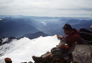
Among the slides in a set labeled "Jeff Park 1956" was this mountain shot:

I've been to Jefferson Park several times, and the view from there doesn't look like this. I guessed that the slide had been mis-filed. 

One of the wonders of the Internet, in my view, along with song recognition, speech-to-text capability, and worldwide navigation, is image search, whereby search engines return images similar to one you provide. I use this page to perform image searches at Google, Bing, and Yandex simultaneously, because sometimes I get the best results from each of those sites. In this case, Bing volunteered that the picture looked like Mt. Shuksan, and images found by Google and Yandex agreed. 

Mt. Shuksan is nearly 300 miles from Mt. Jefferson.

 Another slide in the "Jeff Park 1956" collection was this one:

  
I suspected that it was related to the picture of Mt. Shuksan, but I wanted to be sure. I searched for images taken from the top of Mt. Shuksan, but I didn't find anything that looked like this. Then I used Google Earth (another Internet wonder) to virtually plop myself on top of the mountain and look around. When I did, I found this essentially perfect match:

So the picture was, indeed, taken from the summit of Mt. Shuksan. 

From time to time, the power of the Internet really amazes me. Image search made it possible for me to identify an incorrectly labeled mountain, and Google Earth allowed me to determine that a picture I guessed was taken from the top of that mountain over 60 years ago was truly taken there.


Thursday, March 10, 2022

Buffy at 25

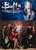
25 years ago today--March 10, 1997--Buffy the Vampire Slayer debuted on TV. I didn't start watching until a few years later, but it quickly became my favorite TV show. At some point it morphed into my favorite TV show ever. Now I call it the best TV show ever. I suspect I'll always feel that way.

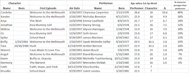
The twenty-fifth anniversary of Buffy got me thinking about, well, years, and in particular about the differences in ages between the characters on the show and the performers who played them. Rivers of words have been devoted to the show and the characters and the people behind the episodes, not to mention the meaning of it all, but I've seen only passing references to the fact that, for example, when the show first aired, 26-year-old Charisma Carpenter was playing high school sophomore Cordelia Chase. Our first few times through the series, my wife and I completely bought Carpenter as a fifteen- or sixteen-year-old, but now that we know she was a decade older, she looks less high schoolish to us. That doesn't mean she's less good in the role. She's still a great Cordelia. It's impressive that she wasn't just portraying somebody ten years younger than she was, she was playing a character 40% younger than her years. That can't be easy. 

It was similar for Nicholas Brendon as Xander. He was also about 10 years older than his character. Even today watching him in Buffy Season 1, I have no trouble seeing him as a sixteen-year-old boy. I'm not sure what that says about him. Or me.

At the other end of the spectrum are Mercedes McNab as Harmony, who at the time of Buffy's debut was a high school junior playing a high school sophomore, and Michelle Trachtenberg as Dawn, a fifteen-year-old playing a fourteen-year old at the time she joined the show.

Here's some information I compiled on ages of Buffy characters and performers once I got it into my head to look this stuff up. I apologize for it being in the form of an image instead of a table, but I couldn't find an easy way to convert an Excel spreadsheet into a decently-formatted HTML table.


Tuesday, January 25, 2022

Image Metadata: The Metadata Removal Problem

 This is part 6 of my series on metadata for scanned pictures.

Part 1: The Scanned Image Metadata Project

Part 2: Standards, Guidelines, and ExifTool

Part 3: Dealing with Timestamps

Part 4: My Approach

Part 5: Viewing What I Wrote

Part 6: The Metadata Removal Problem (this post)

Part 7: Thoughts after 4000+ Scans


When I embarked on this project, I knew it'd be a challenge to figure out how to put metadata into image files. I expected that some programs would be better than others at showing the metadata I'd put in. But I didn't realize I'd have to contend with programs that silently strip metadata when you ask them to do something completely different. Caroline Guntur's blog post opened my eyes:

Many cloud platforms and social media sites will not upload, or retain the [metadata] in your photos. Some will even strip the information completely upon download.

So I can upload an image file with metadata, but the uploaded file might not have it. Or I can download a file with metadata, but the downloaded file might not have it. Ouch!

I shouldn't have been surprised. Especially on social media sites, photo metadata has acquired a reputation as a security and privacy risk. The GPS coordinates for where a photo was taken (typically included in the metadata by cell phones) have drawn particular attention. Some sites have responded by removing most or all metadata from uploaded images (sometimes while keeping it for their own use). That has drawn the ire of many photographers, who have been understandably unhappy about having, among other things, their embedded copyright notices removed from their pictures.

It got me to wondering: if uploading and downloading images may affect their metadata, what about other ways of moving files around? Is email safe? Texting? I decided to do some poking around.

I looked into two basic scenarios:

  • Upload/Download: Is metadata maintained in image files that are uploaded to a web site or cloud service and then downloaded? This scenario covers social media sites like Facebook, Instagram, and Twitter, as well as cloud storage platforms from Google, Apple, Amazon, etc.

  • Point-to-point Communication: Is metadata maintained in images sent via email, texting, or instant messaging (e.g., WhatsApp and Facebook Messenger)? And what about Airdrop, Apple's close-range wireless mechanism for transferring files from one device to another?

Upload/Download Scenarios

IPTC is not just the name of a metadata standard. It's also the abbreviation for the organization that created it: the International Press Telecommunications Council. Among its activities is looking out for the intellectual property rights of its members. One of the ways it does that is by checking how well a variety of web sites adhere to the IPTC's request that metadata in uploaded image files be left intact. Every three years since 2013, the IPTC has tested a variety of sites to see whether they retain four fields the IPTC considers particularly important: Caption/description, Creator, Copyright Notice, and Credit Line ("the 4Cs"). The latest results (from 2019) cover 16 sites and are here. I encourage you to read the report (it's not long), but the highlights are that "good" sites (i.e., those retaining the 4Cs) include Flickr, Google Photo and Drive, Dropbox, and Microsoft OneDrive. The "bad" sites (i.e., those not retaining the 4Cs) include Instagram, Facebook, and Twitter.

The IPTC's test results are interesting, but they're silent regarding the retention of the two timestamps I care about ("when taken" and "when scanned"), and they have nothing to say about  Apple's iCloud, which I think is a serious omission. I decided to do some testing of my own.  

It's useful to distinguish sites whose primary purpose is storage and accessibility from those whose primary purpose is sharing. Google Photos and Apple iCloud Photos, for example, push themselves as services that let you securely store your photos (and videos) in the cloud and have them accessible from all your devices. They support sharing photos with others, but that's not their primary purpose. You could easily make use of these services without ever sharing anything.

In contrast, the primary reason to upload photos to social media services like Facebook, Instagram, and Twitter, is to share them with others. The purpose of uploading photographs is for other people to see them.

Sites for Storage and Accessibility

I uploaded an image file to the following services, then I downloaded it and checked to see if the Exif, IPTC, and XMP copies of the four fields I use (description, copyright, "when taken", and "when scanned") remained intact. My findings were consistent, both with one another and with the results of the IPTC's testing:

  • Google Photos: All my metadata was preserved.
  • iCloud Photos: All my metadata was preserved.
  • Google Drive: All my metadata was preserved.
  • iCloud Drive: All my metadata was preserved.
  • Microsoft OneDrive: All my metadata was preserved.
  • CrashPlan for Small Business: All my metadata was preserved.

This is reassuring. Storing an image file in cloud storage is unlikely to change its metadata. This is good news for those of us who believe in cloud-based backups.

My experiments were based on the default behavior for these sites, and I suspect that's the case for the IPTC's, too. According to Consumer Reports, Flickr can  be configured to omit metadata when images are downloaded, and it's possible that the same is true of other storage and accessibility sites. However, anybody who configures a site to omit metadata in downloaded images is hardly in a position to complain if images downloaded from that site lack metadata.

Sites for Sharing

Social media sites such as Facebook and Twitter are perhaps the best known sharing-oriented web sites, but the umbrella over such sites is broader than that. Also covered are dating sites (e.g., Tinder and eHarmony), for example, as well as sites for selling things (e.g., eBay and craigslist). 

I didn't test how these sites handle image metadata, because others (e.g., Consumer Reports and Kapersky, in addition to the IPTC) have covered this ground better than I could. They've all come to the same conclusion: social media and other sharing-based sites typically remove metadata from uploaded photographs. 

Social media and other sharing-based sites are a poor choice if you want to share not just pictures, but also their metadata.

Point-to-Point Communication

The point-to-point communication mechanisms I considered are email, texting and instant-messaging, and Apple's Airdrop. I did little experimentation of my own, because this terrain has also been well explored by others.

On the email front, the consensus is that image files sent via email retain their metadata. I did a few simple tests, and my results showed the same: metadata was preserved.

Email can contain images either inline (i.e., displayed in the message itself) or as attachments. In 2020, Craig Ball published a blog post describing how inline images in email appeared to have no metadata, while attached images did. His investigation revealed that the inline images he received did, in fact, contain all the metadata in the images that had been sent, but the metadata somehow got stripped during the process of saving an inline image as an independent file. The blog post went on to explain how to work around the problem.

To see if I could reproduce his results, I emailed an image to myself twice, once as an attachment and once as an inline image. In both cases, I was able to see the metadata without any trouble. However, the email client I used was Thunderbird, whereas Ball used Gmail and Outlook. That could explain why we experienced different behaviors.

It's comforting that Ball's conclusion aligns with the consensus that images sent via email retain their metadata. At the same time, it's disturbing that extracting an inline image from a message may cause its metadata to be removed. Sigh.

But that's email. These days, more photos are probably sent by text or instant message. How does image metadata fare when communicated in those ways?

On the instant-messaging front, things are clear. I didn't run any tests myself, because the net community speaks with a single voice:

  • WhatsApp removes image metadata.
  • Facebook Messenger removes image metadata.
  • Signal removes image metadata.
  • Telegram removes image metadata.

There are ways to work around this behavior (e.g., by sending photos as documents), but the fact remains that these instant-messaging services redact photo metadata as a matter of policy.

When we shift from instant messaging to good, old-fashioned, ordinary texting, the air is fogged by the fact that smart phones typically obscure whether you're engaging in good, old-fashioned, ordinary texting. Users of the Messages app on Apple devices, for example, typically communicate with one another via iMessage. iMessage is an internet-based protocol that is quite different from the cell phone system's SMS/MMS technologies (which underlie good, old-fashioned texting). iMessage works only between Apple devices and only when an internet connection is available, so for texting to or from non-Apple devices or when internet access is lacking, the Messages app employs SMS/MMS. The protocol used for a particular sent message is indicated in Messages by the bubble color (blue for iMessage, green for SMS/MMS), but all incoming messages look the same (grey bubble), regardless of whether they were transmitted using iMessage or SMS/MMS.

This means that a text message sent or received using Messages might be a "normal" text (conveyed via SMS/MMS), but it might be an iMessage text, depending on whether the other party (or parties) in the conversation were using Apple devices and whether an internet connection was available. My understanding is that a similar bifurcation exists on Android devices, where the Google Messages app may send and receive messages using either RCS or SMS/MMS, depending on the capabilities of the parties' devices and those of their service providers.

The effect of texting on image metadata appears to be:

  • Photos sent using the iMessage protocol retain their metadata. This is both the wisdom of the net as well as my personal experience. Photos texted between Apple devices arrive with their metadata intact (unless the lack of an internet connection causes Messages to fall back on SMS/MMS),
  • Photos sent using the RCS protocol retain their metadata. It's harder to find information about RCS than iMessage, but the sources I consulted (e.g., here and here) agree on this point. Photos texted between devices running Android should arrive with their metadata intact (provided both sender and recipient(s) are using RCS).
  • Photos sent using SMS/MMS may retain their metadata. This is the scenario that applies to texts between different kinds of devices (e.g., between iOS and Android devices). Most (but not all) Internet sources I consulted said that MMS strips metadata. My favorite overview of the situation is by Dr. Neal Krawetz. His summary is that "the entire delivery process for texted pictures is just one bad handling process after another." I lack the expertise to evaluate the accuracy of his analysis, but it looks quite plausible, and it would explain the varying behavioral descriptions I found elsewhere on the internet. I feel confident in stating that transmitting photos via SMS/MMS might retain their metadata.
Stepping back from the details, we can say that instant messaging apps scrub metadata from photos, and sending photos by text may or may not have it scrubbed. Texting photos between Apple devices is a good bet as regards metadata retention, but it's important to make sure that both sender and receiver see blue bubbles in the Messages app.

The final point-to-point communication mechanism I looked at is Apple's Airdrop. I'd always thought of Airdrop as simply a way to wirelessly copy a file from one Apple device to another, but that's not quite right. A standard file copy entails copying a sequence of bytes from one place to another. What the bytes represent (e.g., a document, an image, the state of a game) is immaterial. The copying program doesn't care what the bytes are for. It just copies them.

Copying an image file in that manner would copy the file's metadata, because the copying program wouldn't care that it's an image file. It would simply copy the bytes, just like it would with a document or a game state, etc. But that's not how Airdrop behaves. By default, metadata is removed from pictures that are Airdropped. This can be overridden by enabling the "All Photos Data" option, but it's a non-sticky setting, so it has to be explicitly enabled each time Airdrop is used to copy images from one device to another. 

Airdrop's "strip metadata by default" behavior makes it less convenient and less reliable for sharing photos with metadata than a simple file-copying program would be.

Conclusion

Once you get metadata into an image file, you don't want to accidentally lose it, either for yourself or for those with whom you want to share it. The safest things you can do with image files (from the perspective of metadata retention) are to upload them to sites designed for storage and accessibility (as opposed to sharing) and to send them via email. The worst things you can do (again, from the perspective of metadata retention) are to upload them to sharing-oriented sites (e.g., social networks) or to text them using instant-messaging services.