Friday, January 20, 2023

The Beardsley Salome Dinnerware Project, Part 2: Production

Part 1 of my report on this project is here

Just as creation of the artwork for my Beardsley dinnerware took longer and was more difficult than I'd anticipated, production of the dishes was also unexpectedly challenging. Without the extraordinary commitment of Enduring Images (the company who made the dishware), I'd still be looking at  mockups on a computer instead of dinnerware on a table.

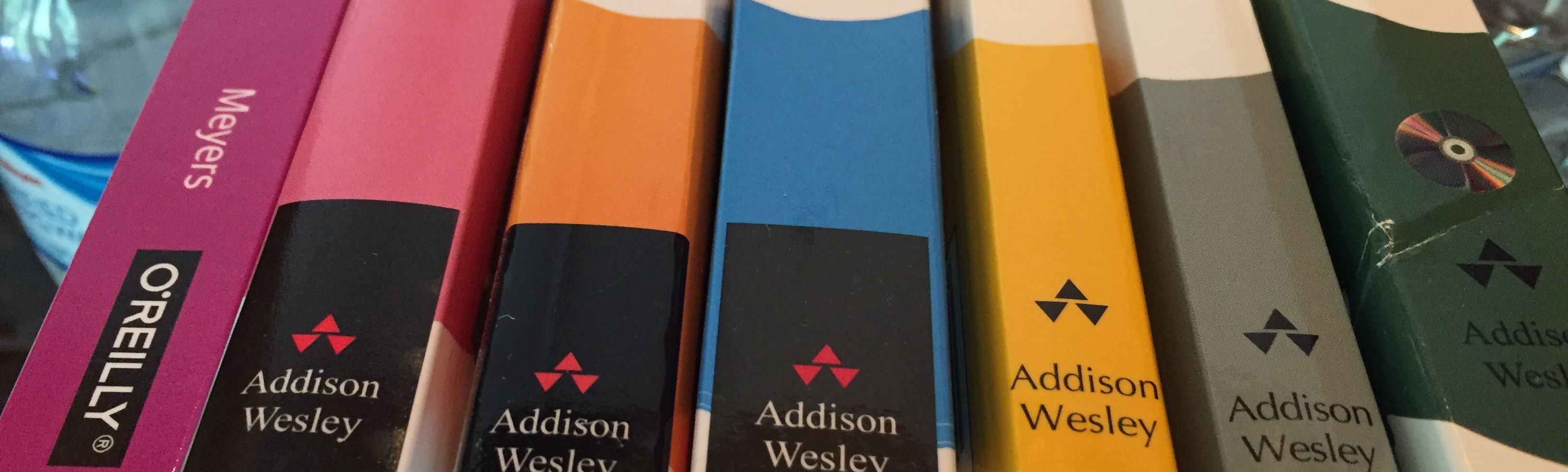
Let's start with how things end. Here's a photo of one of the dinner plates I had made, along with a smaller plate and a bowl:

Here are the serving dishes:
And here are more of the bowls, because they are the only component of the set that uses color:

The collection is nice, but it's not as nice as I'd hoped. The pieces look pretty good from a distance, but the closer you look, the more you notice things that aren't as they should be. Well, the closer I look, the more things I notice that aren't as they should be. I spent several months staring at zoomed-in copies of Beardsley's drawings and at dinnerware mock-ups using those drawings. I notice some things other people wouldn't.

But I'm getting ahead of myself. Having seen how production ended, let's shift to how it began.

In September 2021, shortly after starting the project, Enduring Images (EI) ran tests to ensure that the blanks I'd selected were compatible with their production technology. As a test image, I selected a drawing from Beardsley's work on Le Morte Darthur, because I felt that its areas of solid color as well as its use of fine lines was representative of the images I'd want for my dinnerware. At that time, I had not yet decided to use only artwork from Salome.

When I got a test plate back, I was surprised to find that the edge of the decal could be both seen and felt. It wasn't obvious, but once you'd noticed it, it was hard to ignore. Patrick, my contact in Production at EI, explained that this was a flux shadow. I didn't like it, so Patrick outlined three approaches to eliminating it. I'll refer to these approaches as Techniques A, B, and C, but for those who must open every box to see what's inside, A is on-glazing with a flux topcoat and full-coverage decals, B is on-glazing with a non-flux topcoat, and C is in-glazing.

Each of these approaches has limitations. Technique A works for relatively flat pieces, but it can't be used for bowls. Technique B tends to yield a matte finish, rather than a glossy one. Technique C has a poor track record. Patrick had found that it was rarely successful.

Technique A was a variation on what had been done for the test plate. I was confident it would leave no flux shadow on the relatively flat pieces it was applicable to. I had EI run additional test plates using Techniques B and C. As promised, neither produced a flux shadow. Surprisingly, Technique B produced glossy results. It also yielded a more intense black than Technique C. 

I recommended we use Technique B for the dinnerware. Unlike Technique A, it was applicable to all dish shapes, and it yielded deeper blacks than Technique C. I then threw myself into production of the artwork, a task that ended up stretching over the next eight months. For details, see Part 1 of this report.

Three months later, we ran some samples to test the colors for my bowls. I reminded Patrick of the importance of avoiding a flux shadow. He told me he'd selected Technique C for just that reason. He didn't say why he'd chosen Technique C over Technique B, and I didn't ask.

After five more months (i.e., at the end of July 2022), I submitted final artwork for the full dinnerware set. Patrick started work on a dinner plate as a pre-production test. We expected smooth sailing. The seas were not cooperative. After three failed trials, Patrick, taking into account the tribulations I'd endured with the artwork, began to talk of a Beardsley curse. After several additional failures, he concluded that Technique C was not going to work for the project.

The stumbling block was the large swaths of solid black, especially on the rims. Patrick had been unable to find a way to fire the plates such that these areas emerged a uniform color and texture. The picture below is an example of his results. The black in the middle of the plate is deeper than that on the rim, there is cracking in the color at the rim extents, and striations are present at the rim edge in the upper left.

We retreated to Technique A. It dodged the problems of Technique C, but a new issue became apparent. Some areas that were supposed to be white were coming out grey. In the image below, compare the original artwork (above) with the image on the plate (below). On the plate, there's a grey haze around the peacock and the headdress that is not present in Beardsley's drawing:

Patrick explained that the black areas tend to bleed a little, and there's no practical way to eliminate it.

At this point, I'd been working with EI for more than 13 months, and pre-production testing was in its fifth month. I was having only 41 pieces produced, so the business case for continuing to work with me had long since evaporated. EI as a company and Patrick as a individual had invested far more time and energy in the project than could ever be justified, and they had done it with a cheery attitude and an earnest commitment to the project's success. I would have liked to find a way to eliminate the flux shadows on the bowls that I knew Technique A would leave behind, and I would have liked to play around with techniques to reduce the bleeding giving rise to grey areas, but EI hadn't signed up for what had become a research project. You don't ask people who've already gone above and beyond to go  higher and further. I told Patrick that testing was over and it was time to make the set.

The dishes showed up about two months later. Creating them involved printing, hand-placing, and firing 82 decals, one for the top of each piece and one for the bottom. Most decals were unique. Bottom decals had to be matched with their top-of-the-plate partner and had to be oriented the same way. Opportunities for errors were rife. I was pleased to see that only one decal had been placed incorrectly. 

I noticed some significant loss of detail in fine white lines present in the artwork. Compare the artwork below (left) with its appearance on a plate (right):

I also saw that the black rims were not as uniform in color as on the test plates we'd run. Contrast the mottled appearance of the production plate (left) with the more uniformly black test plate (right):

Patrick explained that in an effort to minimize the bleeding of blacks into adjacent white areas, he'd tinkered a bit with the production process. That had resulted in some loss of fine details as well as a reduction in the density of the blacks.

During the months between initial firing tests in autumn 2021 and pre-production testing at summer's end 2022, Technique B had somehow dropped off the radar. I hadn't forgotten it, however. When Patrick remade the plate with the mis-placed decal, I had him make a second copy of the plate using Technique B. That allowed me to compare the results of Techniques A and B on a piece of my dinnerware.

It was an interesting exercise. The rim color for Technique B (right) was much better than for Technique A (left):

That photo was taken under unusually strong light, and it exaggerates the difference. Even under normal lighting, however, it's clear that Technique A's black is mottled, while Technique B's is nearly uniform.

On the other hand, Technique A (left) retained drawing details better than Technique B (right):

Technique B yields better solid blacks, then, but it leads to a loss of detail beyond that which Technique A already incurs.

That's how the story ends. I finally have a set of dinnerware based on Aubrey Beardsley's drawings, something I'd yearned for since 1989. But it's not the set I'd envisioned. The areas that should be solid black are more dark grey. If you look closely, or if you see them under strong light, you see that the color is somewhat mottled. The images lack details present in Beardsley's drawings, and some areas that should be white have a grey haze to them. The set is still nice. To the casual observer, it's very nice. It's just not as nice as I'd hoped. 

I suspect it would be possible to do better, but getting there--finding the right combination of toner, topcoat, kiln temperature, firing time, and who-knows-what-else--would be time consuming and expensive. It'd be a research project--even more so than this endeavor ultimately became. That's not in the cards.

I'm lucky I got this far. Without Enduring Images' dedication to seeing this project through, I wouldn't have. I remain grateful to them and to Patrick for their exemplary patience, cooperation, and assistance.


Sunday, January 15, 2023

Stained Glass Panels, Part 4

This is part 4 of a series about my designs for stained glass window panels.

Part 1: The eclipse panel

Part 2: The book data panel

Part 3: The hummingbird feathers panel

Part 4: The dichro panel (this post)


In parts 1-3 of this series, I described stained glass panels I designed for transom windows above doors. My fourth panel was for a window on a wall above a stairwell. It was nearly five times as big as the transoms: roughly two-and-a-half by five feet.

My goals were clear from the get-go. I wanted a design that looked like a metal screen and that was essentially opaque. The view through the window (which included a chunk of roof) would detract from the panel, so I wanted to hide it. I quickly came up with this:

I experimented with a lot of color options:

I should have saved myself the trouble. Panel makers told me that the inner right angles on the pieces of glass around the squares would be weak and crack or break. They had to go.

I returned to the drawing board and emerged with a number of designs that had no inner right angles:

Panel makers clarified that any concave angle ending in a point (as opposed to ending in a curve) would suffer the same weakness, so designs 6-8 were out. The simple act of rounding the corners of the squares (design 5) would solve the problem, but I didn't like the way it looked. Rotating the squares 45 degrees (design 1) would also solve the problem, but that didn't look like the screen I had in mind. Nor did designs 2-4.

It occurred to me that an alternative to rotating all the squares 45 degrees was to rotate the connecting lines 45 degrees instead. That was equally effective in eliminating the inner right angles, and it yielded this design, which is the one I ended up using.

Meanwhile, I'd decided I wanted to use dichroic ("dichro") glass for the squares. Dichro glass is magical stuff. It changes color depending on the angle from which it's viewed. Its appearance also depends on whether you're seeing transmitted light (e.g., during the day) or reflected light (e.g., from inside lights at night). Dichro elements in the panel would change colors as you walked by or went up and down the stairs, would look different night and day, and would present difference faces inside and outside the house. I couldn't resist.

I ordered some dichro samples, taped them to a window, and took photos of them from different angles to see what they'd do. These photos show five samples from different viewpoints:

I settled on Kokomo's 33G-MA (second from left in the shots above), and mocked up my design using the photos I'd taken. My goal was to approximate the panel's appearance, at least during daytime. Here are the mockups:

The actual panel puts the mockups to shame:

The three pictures on the left were taken during the day. They show the dichro with transmitted light. The rightmost picture was taken at night. It shows reflected light. In the two middle pictures, different squares show different colors. That's probably because the viewing angle varies from the top of the panel to the bottom, but a contributing factor could be variations in the dichroic coating on individual pieces of glass.

Walking down the stairs provides a steady change in viewing angle that brings the panel alive:

I really like this panel. During the day, the hot-magenta dichro squares glow with color from the most common vantage points, and they segue to a nice peach when viewed from wider angles. As you walk by, they put on a chromatic show. 

I'm pleased that I heeded the lesson from panel 3 and made this panel opaque. The dichro squares against the wispy white background pop, just as I'd hoped, and there's no distracting view of sky, clouds, trees, or roof peeking through. 

There's a price for that. The panel blocks most of the light coming through the window, and the stairwell is now dimmer than my wife and I would prefer. I knew that putting a panel in front of the window would darken things a bit, but the effect is more pronounced than I had expected. My experience with the transom window panels led me to believe that putting a panel over a window wouldn't have much of an impact on the light in the room, but in retrospect, that was because each of the transoms was over a door with a much larger window in it. The larger windows provided enough illumination that reducing the light through the transoms didn't matter. In the case of the stairwell, the panel covers the only window. The darkening effect is considerable. 

The takeaway from panel 3 was that what's outside the window should affect the design of the panel. The takeaway from panel 4 is that what's inside the window should affect it, too.


Friday, January 13, 2023

Stained Glass Panels, Part 3

This is part 3 of a series about my designs for stained glass window panels.

Part 1: The eclipse panel

Part 2: The book data panel

Part 3: The hummingbird feathers panel (this post)

Part 4: The dichro panel


I started design work on my third transom window panel even before the second panel had been delivered. My goal was something dog-related. The initial mockup was intended to depict a wagging tail in a triptych-like design:

A friend remarked that it looked like a pineapple. Sigh.

Abandoning the canine connection, I played around with variations on a couple of shapes that came to me unbidden:

The exercise was interesting, and I think designs 1 and 2 show promise, but I didn't like them well enough to pursue. I set them aside and returned to the dog theme. My approach this time was to build on trajectories of bouncing balls. (Dogs like to fetch them.) The mathematics of such trajectories avoided the need for me to do any drawing, though you'll note a terrible depiction of a Chuckit! ball launcher at the left in design 6:

None of these did anything for me.

Casting about for a different course, I considered encoding a dog-related message in a geometric version of Morse code. That led to designs such as this (which I believe depicts "Good Dog", although I don't remember exactly how):

I set the the dog idea aside again and turned my attention to the Rufous hummingbirds that frequent the feeder near the window the panel was destined for. As you can see in this photograph from audubon.org, the throat feathers on the males are striking:

I mocked up a conceptual design:

I approached some stained glass artists about fleshing out the design and making the panel. I also asked about the possibility of incorporating iridescent and/or dichroic glass, because I thought that would be visually interesting and could help convey the dazzling effect the feathers can produce. I inquired about incorporating prisms into the design, too, because I thought it would be fun to have light spectra scattered on the walls near the panel.

I chose a local artist, Sondra Radcliffe of Ambiente Art Glass, to advance my design from concept to reality. Visiting her workshop was a revelation. I selected the glass for my first two panels from manufacturers' online catalogs, but Ambiente Art Glass uses only hand-blown glass for their panels, and they've spent decades curating a collection of unique glass pieces for their projects. It's beautiful and remarkable stuff--colors of various levels of translucence layered on top of one another to produce 3D effects within a sheet of glass. Even the clear pieces show character, e.g., cracks, bubbles, and slight distortions. The glass in my third panel is in a vastly more sophisticated league than those that came before it.

We ultimately decided against iridescent and dichroic glass, but Sondra incorporated a number of beveled glass jewels. They scatter light when the sun shines through them. She took my idea of a hummingbird throat and reinterpreted it as a wave. This is the panel she created:
A close-up makes it easier to appreciate the glass's complexity, as well as the skill with which Sondra selected, cut, and arranged the pieces:

Alas, the panel isn't as successful as I'd hoped. It's my fault. I made two serious mistakes. First, I failed to consider the view through the window when I used clear glass in the design. I'd imagined the colored glass against a white background (as in my conceptual mockup), but the view through the window is largely of trees. That makes it harder to appreciate the colors in the panel. It looks best after a snowfall:

My second error was failing to realize that the window is too high and the deck ceiling too wide to allow sunlight to directly reach the panel. That means the prismatic effect I'd hoped for from the glass jewels doesn't occur. 

I'm still happy with the panel. It's a big artistic step up from the panels that preceded it, and it has the attractive property that the closer you examine it, the better it looks. The big takeaway, however, was that when designing a panel, you have to take into account where it will be and what will be visible behind it. You can't design a stained glass panel in isolation. I took that lesson to heart in the design of my next panel.

Thursday, January 12, 2023

Stained Glass Panels, Part 2

This is part 2 of a series about my designs for stained glass window panels.

Part 1: The eclipse panel

Part 2: The book data panel (this post)

Part 3: The hummingbird feathers panel

Part 4: The dichro panel


Some months after installing my first transom window panel, I started work on the second one. It was for a window near my office, so I decided to use data related to my books as the basis for the design. 

I first thought of simply plotting sales and/or royalties over time, because that would allow me to use Excel to generate a graph, and I could use the graph as my design. I plotted unit sales for 1991-2018 (top), royalties for the same period (middle), and both together (bottom), then slapped them into mockups with a waterglass background. This is what I got:

The colors in the graphs correspond to the colors of my books:

None of these designs excited me, and I was skeptical that it would be practical to build them.

My next idea was to have the width of the panel represent years between 1990 and 2020 and to stack two solid circles for each book on its year of publication. The area of one circle would correspond to the book's lifetime sales, the other to its lifetime royalties. That yielded this:

This did nothing for me. As I wrote to a friend, "It looks like a collection of washers in a 1960s color scheme."

Retaining the idea of the panel representing time horizontally, I added the idea of it representing lifetime sales vertically. That let me plot total sales against year of publication:

Sizing the points to reflect lifetime royalties, getting rid of the grid lines, and throwing in some candidate glass choices gave me this:
I played around with other shapes, too.
I liked circles best. I found the vaguely planetary look pleasing. In addition, Margo Crane, who made my first panel and whom I planned to use for this one, confirmed my suspicion that she lacked the expensive equipment needed to cut the glass for these kinds of "shapes floating in space" designs. 

I added grid lines to make the design buildable, tinkered with some details, and put in the glass choices that Margo and I agreed on. This was my final mockup:

The panel showed up about six weeks later:
That's what it looks like, but it's not the way it usually looks. A transom window is up high (above a door), and this particular window is typically viewed from a hallway, which provides a view from the side. The usual way to see this panel, then, is from below and to the side, like this:

I had taken that into account when developing the design. My decision to use clear waterglass as the background was based on the knowledge that the white structure behind the window when viewed from this angle would provide a blurred white background. That's what I wanted: colored circles against a white background. I think it works well. Unfortunately, I failed to take the view through the window into account when I designed my third panel, and, as you'll see in part 3 of this series, that was a mistake.

Wednesday, January 11, 2023

Stained Glass Panels, Part 1

This is part 1 of a series about my designs for stained glass window panels.

Part 1: The eclipse panel (this post)

Part 2: The book data panel

Part 3: The hummingbird feathers panel

Part 4: The dichro panel


Near the end of 2017, I decided I wanted to have stained glass panels made for transom windows over doors in our house. By "panel," I mean a stained glass insert to be pushed up against the inside of an existing window. The effect is that of a stained glass window, but the panel isn't exposed to the elements. I looked online for designs I liked, but nothing grabbed me. I tried to find someone to design panels for me, but that didn't pan out. So I decided to take a stab at designing the first panel myself.

This was a laughable decision. It combined artistic design, an area where I have neither talent nor experience, with stained glass, a medium about which I knew nothing. It was nevertheless a way forward, so I set out down that path. I took the total eclipse that had taken place a few months earlier as my design motif. The area of totality had been not far from my home, and the experience of seeing it was still fresh in my mind. 

For a skilled stained glass artist such as Susan Humphrey of Rockcrest Glass Studio, the eclipse led to wonderful works of art such as this:

Solar Eclipse from Rockcrest Glass Studio

I'm no Susan Humphrey. As an example of the artistic league I'm in, here's the "eclipse cake" I prepared for the event. It's not stained glass, but I think the sophistication of the work speaks for itself: 

 
Among the many artistic skills I lack is the ability to envision something that doesn't exist. I needed a way to mock up stained glass panel designs so that I could look at them. In a move that will not surprise you if you've read about how I designed custom dinnerware, I turned to PowerPoint. Its support for visual design work is limited, but nowhere near as limited as my imagination. 

I initially wanted a lot of light to come through the panel, so I chose phases of the eclipse against a clear waterglass background:

I then mocked up a design that more accurately reflected the eclipse I had seen. That involved adjusting the phases of the eclipse to progress in a more diagonal direction than purely left to right. It also entailed making the sky blue. This was the result:
The blue background seemed kind of flat, so I shot for more visual interest by using a wispy blue-purple background instead:

I learned that the white ring surrounding the black circle in the center of the panel would stymie most makers, because they typically lack the ability to cut a ring of glass. (Cutting circles is easy, but cutting rings is apparently hard.) I revised the design to eliminate the ring. I also went back to the horizontal evolution of eclipse phases, because people found the diagonal placement off-putting. My final design looked like this:

The image looks deceptively like a photograph, but it's nothing more than a few PowerPoint shapes with online images of glass samples as fill patterns. 

Each piece of glass in the design is a wispy mixture of two colors (e.g., blue and purple, yellow and white, etc.), and in the real world, each piece of such glass is unique. A mockup can never do more than approximate what a panel would look like. What it actually looks like is determined by the artist choosing, cutting, and placing the glass pieces and then soldering them together. For this panel, that artist was Margo Crane. Her Etsy shop for stained glass work is here. Here's the panel she delivered:

I'm quite happy with it. It's visible from my bed, so it's one of the first things I see every morning. It's a nice way to start the day.

The design remains childishly simple, but working on this panel taught me a lot about the kinds of glass that are available and about how to use PowerPoint as a mockup tool. It also introduced me to a number of stained glass artists and their studios, both local and remote. It put me in a position to hit the ground running with the design for my next panel.