In 1989, my friend, Karen, invited me to an exhibition of drawings by Aubrey Beardsley at Harvard's Sackler Museum. I'd never heard of Beardsley or the Sackler Museum, but Karen was working on her Ph.D. in Art History, and I wasn't about to turn down a chance to attend an exhibition with an expert.
 |
The Climax
|
.jpg) |
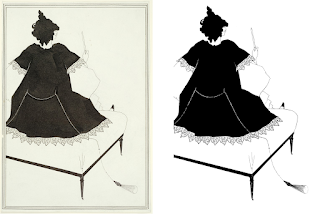
The Peacock Skirt
|
My memory of the drawings themselves is hazy, but I clearly remember thinking that Beardsley's black-line artwork would look great on white dinner plates.
The Peacock Skirt, for example, seemed like it would make a fine choice, as would
The Climax.
I wasn't the first to look at Beardsley's drawings and think dishes. In 1979, Poole Pottery introduced its Beardsley Collection, and for its 2020 exhibition, Tate adorned mugs and plates with Beardsley artwork. These days, you can find plates and mugs with Beardsley drawings at ifarfor, though you may want to take into account that it's in Russia before placing an order.
I've long liked the idea of custom-made dinnerware. When the Internet blew the lid off the Pandora's box of product personalization in the 2000s, I started looking for places to make dishes for me. It wasn't difficult to find companies to design and produce limited runs of tableware, but their idea of a short run was a dozen or more place settings, each with five or more pieces. Including set-up fees and minimum order requirements, total costs started at several thousand dollars. That might pencil out for a restaurant, bed and breakfast, private club, or corporate dining room, but for an individual like me? No.
I bided my time. In August, 2021, as part of a spot check into options for made-to-order dinnerware, I discovered that Enduring Images offered custom sets under attractive conditions. From artwork you supply, they create decals using ceramic toners. The decals are applied to "blanks" (i.e., dishes provided by you or by them) and fired in a kiln. The results are functionally indistinguishable from dishware you'd buy at retail. They're no more prone to scratching than mass-market tableware. If the blanks are dishwasher- and/or microwave-safe, the dishes are, too.
This was exactly what I was looking for. I began work designing a Beardsley dinnerware set.
The Salome Challenge
Aubrey Beardsley's best-known work is probably the 16 illustrations he created for Oscar Wilde's Salome. The Peacock Skirt and The Climax are among them. However, these drawings comprise a mere drop in Beardsley's artistic bucket. His work for Thomas Mallory's Le Morte Darthur makes up several hundred images, for example, and that's still less than half of what he created before he died of tuberculosis at only 25. My initial plan was to use the drawings from Salome for my dinner plates and to select from his other works for the remainder of my set, but I became so intrigued by the Salome illustrations that I decided to use only them.
The decision was partly motivated by the challenge of pulling it off. I had decided I wanted 12 place settings, even though it's nearly inconceivable that my wife and I would host a meal with 10 other people. In addition, I wanted five serving dishes, because I had found a mix of that many platters and large bowls that I thought looked nice. Finally, I wanted every piece to be unique: each plate, bowl, and platter should have its own look. With 12 dinner plates, 12 smaller plates (for e.g., salad or dessert), 12 bowls, and five serving dishes, that necessitated 41 different designs. The fact that Beardsley produced only 16 illustrations for Salome (plus two front cover designs, one back cover design, and a spine design), well, that was part of the challenge.
Getting the Images
It's easy to find copies of Beardsley's Salome drawings on the Internet. Quality varies, in part because some images are scans of the original drawings, while others are scans of prints made from those drawings. I wanted the best, most authoritative images I could find, so I made a digital bee-line for the Harvard Art Museums. They have nine of the 16 Salome originals.
Scans of these drawings are freely downloadable, but the resolution is terrible. The Peacock Skirt's 745 x 1024 pixels is typical. Printed at 300 dpi, which I consider the bottom of the barrel for print resolution, the image would be about 2.5" x 3.5". That's considerably smaller than I want to put on a dinner plate, much less a serving dish.
Harvard offers higher-resolution imagery, but it's subject to the Harvard Art Museums' licensing policy, which includes this restriction:
Each image must be reproduced in its entirety without cropping, bleeding, alteration, splitting, or other modification.
Beardsley's work for Salome used two colors: black ink and white paper. The drawings are now over 125 years old, so the inks have faded and the papers have yellowed. Compare Harvard's scan of Salome on a Settle (left) with the cleaned-up black and white version I created (right):
 |
Salome on a Settle
|
I believe my version is more representative of Beardsley's work than the original has become. I'm certain it would look better on white dinnerware. However, the Harvard Art Museums' licensing provisions preclude color correction. They also prohibit removing the border present in Beardsley's drawing. That's problematic for my tableware, because I want to use the rim of a dinner plate as the frame around the drawing instead of the border that Beardsley drew.
Harvard's licensing terms surprised me, because Aubrey Beardsley died in 1898. All his drawings are in the public domain, at least in the United States. Such works are free of copyright restrictions. My understanding is that they can be used by anyone in any way.
Of course, I don't want to use Beardsley's actual drawings on my dinnerware. I want to use scans of them. Enter the lawyers. If a drawing is in the public domain, is a scan of it also in the public domain? Or is creation of the scan tantamount to creation of a new work of art that's protected by its own copyright?
I'm not so paranoid to think that Harvard (or any other owner of a Beardsley drawing) will sic their legal team on me if I adorn dishes for my personal use with scans of their artwork. Nevertheless, I've been the beneficiary of copyright protection for the books I've written, so I try to respect the rights of others. Furthermore, I find the legal question interesting. What does it take to make a newly-created image worthy of copyright?
More than simply scanning something else, as it turns out, at least in the United States. In Bridgeman vs. Corel, the court ruled that slavish copies of two-dimensional works fail to contribute the necessary originality needed to quality for copyright protection. (The legal landscape may be different when 3D objects such as sculptures are involved.) Practically speaking, scans of 2D artworks in the public domain are themselves in the public domain. Harvard and other institutions may attempt to impose more restrictive licenses, but it's unlikely they'd survive a legal challenge.
Rather than petition Harvard for higher-resolution scans (and possibly get embroiled in a licensing dispute), I shifted my search from scans of their drawings to scans of prints made from them. Such prints are in many museums, because they were part of Wilde's book, Salome. If you have a copy of the book, you have copies of Beardsley's drawings.
In the end, most of the images I used came from the Princeton University Art Museum. When I first looked at their scans, the majority had
significantly higher resolution than I was able to find elsewhere--nearly six times the resolution of those at Harvard. However, a few scans had relatively low resolution. I wrote to ask about these suspect images. Princeton confirmed the anomalies and said they'd scan again. When they posted the updated imagery a few weeks later, I was surprised to discover that they'd rescanned all the Salome prints, not just the ones with low resolution. The new resolution was nearly twice the high resolution they'd had before! Thank you, Princeton Art Museum!
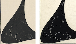
These scans had the best resolution I was able to find, but my goal wasn't maximum resolution, it was highest overall quality for use on tableware. Image resolution was only one consideration. A second consideration was whether a scan was of an original Beardsley drawing or of a print. Originals were preferred. A third was fidelity to the original. Some scans show more details than others. Consider these two versions of a portion of The Toilette of Salome II:
 |
| Detail from The Toilette of Salome II |
The one on the left is from the Princeton
Art Museum and is a scan of a print. The one on the right is from the
British Museum and is a scan of the original drawing. The
Princeton scan is at about 1100 dpi, while that of the British Museum
is at only about 280 dpi, but you can see that there are more details in the scan from the British Museum. For this image, I chose the scan from the British Museum.
I ultimately availed myself of scans from the Princeton University Art Museum, the Princeton University Library, the British Museum, B at Flickr, and Alamy. I paid Alamy a small fee for use of one image. Everything else was free.
Acquisition of the images spanned several months. Some of that time was spent in the legal cul-de-sac of usage restrictions on scans of public domain works, some elapsed as various museums took their time responding to messages I'd sent, and some ticked by as Princeton worked to post new imagery. The dominating activities, however, were searching for and downloading images, examining them for quality and authenticity (some online Beardsley images have been subtly revised), and comparing different scans of the same illustration to find the best versions.
Cleaning the Images
Most scans were of complete book pages. Beardsley's artwork didn't extend to the page edges, so I cropped off the extra space. Some scans were askew, so I straightened them. Then the fun began.
As I noted, Beardsley's drawings (and the prints made from them) are two-color works, but the inks and papers have undergone color shifts since they were created. Scanners pick up color variations, so a scan of a Beardsley drawing will typically yield an image with thousands or tens of thousands of colors. The Princeton University Library's scan of the original drawing for The Black Cape contains a full 117,000 colors. To save space, some institutions store the scans in JPG format, which, as a side effect of reducing the size of a file, may increase the number of colors in the image.
Recreating the original appearance of a Beardsley drawing required taking images with many colors and transforming them into images with only black and white. The program I used for this (XnView MP) has an option to do just that. Check a box, and the deed is done. Applying that directly to downloaded scans didn't yield very satisfactory results. Image details got lost, and artifacts were introduced. Converting to greyscale before reducing to black and white didn't help.
What I found worked best was to adjust attributes of the scan, primarily contrast and exposure, before checking the box to reduce the image to two colors. Each scan had to be tweaked individually to get the best results.
Drawings and prints over a hundred years old have spots, smudges, and other imperfections. Dust specks may be present during scanning. Scanners dutifully record all these things. Combined with the fact that the process of transforming colored pixels into black and white ones isn't perfect, it's no surprise that the two-color versions of scans contained errors. Some black pixels should have been white, and some white ones should have been black. I used a simple image editor (Microsoft Paint, of all things, because it's what I had) to flip the colors of such pixels.
Along the way, I fixed "mistakes" in the scanned images. I'd encounter a few black pixels on the face of a character that looked like they shouldn't be there. Or I'd find a white line in a black garment that petered out when it seemed like it should continue. When that happened, I'd consult the original scan to see what was there. If the pixels were still on the face or still faded away in the clothing, yet they still looked wrong, I'd check scans of prints from other institutions to see if they looked the same. If I could, I'd consult a scan of the original drawing. Unfortunately, the low resolution of Harvard's online scans often made answering questions about image details difficult. I spent a lot of time agonizing over pixels and staring at three monitors: one showing the black and white image I was working on, one showing the scan from which that image was derived, and one showing a different scan of the same illustration (ideally a scan of the original drawing). In cases where I wasn't sure what to do, I just made a choice and moved on. I consoled myself with the knowledge that I was working on artwork for dinner plates and cereal bowls, not retouching the Salvator Mundi.
Rework
I cleaned images of most illustrations more than once. When I first came upon the scans at the Princeton Art Museum, their resolution was so good, I stopped looking for anything better. I knew Princeton was working to address the anomalous low-resolution scans I'd reported, but I didn't realize they were rescanning all their Beardsley prints at even better resolution. By the time the new scans were online, I'd cleaned up the ones I'd already downloaded. Unwilling to leave better resolution on the table, I repeated the cleanup work on the new scans.
I eventually realized that highest resolution didn't always equal highest overall quality. I did the work to clean up the Princeton Art Museum's version of The Toilette of Salome II before recognizing that the British Museum's lower-resolution scan retained more detail. So I cleaned it up, too. Similarly, I did preliminary cleanup work on the Princeton Art Museum's scan of a print of The Black Cape before discovering that the Princeton University Library (a separate entity from the Art Museum) offered a scan of the original drawing. The drawing had authenticity on its side, so I stopped working on the scan from the print and shifted my attention to the one from the drawing.
The Blanks
Interspersed with my work acquiring images was work acquiring the dishes to serve as blanks. I considered square and squarish shapes, with and without texture, before deciding to stick with classic untextured rimmed round plates.
I wanted a bright white to provide good contrast with the black Beardsley drawings, and I didn't want to try to evaluate shades of white from online photos, so went to the local Bed, Bath, & Beyond (BBB) to look at what they had in stock. Their Neveah White line had a color I liked, it featured pieces in shapes and sizes I found appealing, and, being on clearance, it was attractively priced. I bought what the store had, and I ordered the remainder from BBB online.
It was amusing to see the pieces trickle in. Oftentimes, plates and bowls arrived in sets of one and two, each from a different store. When I placed the order, I envisioned a shipment from a giant warehouse with shelves of discontinued pieces, not dribs and drabs from stores across the United States.
Many of the pieces I received were chipped, cracked, or otherwise marred. Perhaps I should have expected that from clearance items. The local BBB took them back without fuss, but the process of ordering the pieces, waiting for them to arrive, having Enduring Images run tests to confirm that they would provide a suitable substrate for their decals, realizing that too many blanks were flawed to proceed, and returning them took several weeks.
It also put me back at Square One on the blank front. Well, almost. I had originally decided not to use the blanks offered by Enduring Images, because they didn't have serving dishes I liked. However, their other pieces were acceptable. The BBB platters and serving bowls were a reasonable color match for the Enduring Images dishware, so I went the mix and match route: plate and bowl blanks from Enduring Images, serving dish blanks from BBB.
Enduring Images' dinner plate blanks were back ordered several months. That was initially frustrating, but it turned out not to matter. A time-consuming fight with PowerPoint was building over the horizon...
Designing Dinner Plates
For my dinner plates, I knew I wanted a common rim design with a unique Beardsley illustration in the middle of each piece. But what rim design? I mocked up more than two dozen variations. I started with black adornments on a white rim, but I soon decided I'd remove the rectangular border present in most of Beardsley's drawings and employ a black plate rim as an ersatz frame. This simple device often disguised that I was using images designed for rectangular pages on plates that were round.
My mockups convinced me that the rim should serve two goals. First, it should act as a black frame that neither competes with nor detracts from the artwork inside. Second, it should convey that the dinnerware is based on Salome. I decided to fulfill these goals by employing a plain black band adorned with a copy of the symbol that Beardsley developed for the cover of Wilde's book.
These are my dinner plate designs:
Because I'll eventually forget which drawing is on which plate, and because the academician in me loves attributions, I decided to put a decal on the underside of each plate identifying the Beardsley illustration on it and the source of the corresponding scan. For these underside decals, I added a splash of color. Beardsley worked with black ink, but everyone familiar with the publication process knew that his drawings could be printed in any color. Oscar Wilde recommended scarlet for the artwork on the book's cover. His publisher ignored this request, but in its honor, I decided to use red for Beardsley's insignia on the bottom of my pieces. This is the front and back of one of the dinner plates:
Designing Smaller Plates
I expected the rim design for the smaller plates to go quickly, because I had an idea for it early on. Peacocks are common in Beardsley's work for Salome, and in The Peacock Skirt, there's a peacock perched on Salome's back that I thought would look great on a plate rim. Here's Beardsley's illustration and a rim mockup:
Sadly, I found that the peacock that worked well as a detail in The Peacock Skirt foundered on its own. It evoked more Dr. Seuss than Aubrey Beardsley. I returned to the drawing board.
Some 20 designs later, I had something I could live with. I again wanted a design that tied the set to Salome, but I also wanted something that would look nice stacked atop a dinner plate. For the Salome tie-in, I ended up using the S from Beardsley's lettering for the book title. This entailed considerably more work than I had anticipated. Creating a high-enough-resolution image of a single letter from a photograph of a book cover in a museum exhibition was, well, let's just say I spent a lot of time fiddling with pixels. Four times I junked what I had and started over.
For the artwork in the center of the smaller plates, I decided to focus on heads and faces. That allowed me to give prominence to details of Beardsley's drawings that are easy to gloss over when viewing his compositions as a whole. It also afforded me the opportunity to use parts of his work that hadn't made the cut for the dinner plates.
Here are my designs for the smaller plates:
I find that the black part of the rim lends the impression that some figures are floating above an invisible horizon. The effect came about by accident. The height of the black is simply the approximate height of the left side of the black background in The Climax when put on a plate. One of my experiments was to use that background as a rim design. The result didn't wow me, but it put me on the path of partially black rims, which ultimately led to the design I adopted.
Designing Bowls
The designs for my plates feature a different image on each plate, but a fixed set of colors (black and white). For my bowls, I flipped this around. They feature a fixed image (the Salome symbol from my dinner plate rims), but each bowl employs a different color.
Enduring Images warned me that the colors produced by ceramic toners can differ noticeably from what's displayed on a computer screen. They recommended we run a sample tile with the colors I planned to use. It was good advice. Some colors that were easily distinguishable on screen looked nearly identical on the test tile. I adjusted some color choices, we fired another sample, and we were good to go.
Here are my bowl designs:
Designing Serving Dishes
The serving dishes consist of three platters and two bowls. The platters are rectangular. Two have about the same aspect ratio as Beardsley's drawings. I used full Beardsley illustrations for them, borders and all. One of the platters is narrower, but its shape is a good match for the depiction of Salome in the drawing for the book's list of pictures. I chopped off the rightmost two-thirds of Beardsley's illustration, and the result fit the platter perfectly. Here's Beardsley's List of the Pictures (left) and my platter design based on it (right):
Like the smaller plates, the serving bowls feature details from Beardsley drawings, but this time it's not heads or faces. One bowl (left) shows the powder brush from
Cul-de-Lampe. The other (right) shows the lily sprouting from the blood of John's severed head in
The Climax:
Modifying Beardsley's Artwork
I think Beardsley did fabulous work for Salome. I devoted a great deal of time to the creation of faithful two-color versions of his drawings, but that merely got me to the dishware design starting line. Beardsley targeted rectangular spaces (book pages), while I was designing for circular objects (plates or bowls). This often put us at odds. I felt no compunction about removing elements of Beardsley's pictures in the service of designs I found more attractive. A good example is my treatment of the drawing, John and Salome. On a (rectangular) serving platter (left), I used it exactly as Beardsley drew it, but on a (circular) dinner plate (right), I removed both the border and some horizontal lines:
 |
Different renditions of John and Salome
|
If this puts you off, perhaps you'll feel better when I note that for dishes with modified drawings, the attributions on the undersides indicate that that is the case.
Sins of removal are nothing compared to their artistic antipode: sins of augmentation. In some cases, I added elements to Beardsley's illustrations that he never drew!
This should horrify you. It horrified me. Showing the truth and nothing but the truth, but not the whole truth (i.e., omitting part of an illustration) is dodgy enough. Showing things that aren't true at all is vastly worse. Yet still I put posthumous pixels on Beardsley's pen. There simply were cases where I felt that a lot of Beardsley and a little of me made more visual sense than Beardsley all by himself.
Consider the caricature of Oscar Wilde in The Woman in the Moon. I wanted to use it as one of the faces on my smaller plates, but it's tucked into the corner of a drawing, and its rectangular shape is a bad fit for the circular region I needed to fill. So I extrapolated what Beardsley drew until I had what I desired. Compare his work (left) with what I turned it into (right):
I did more than just add ink around the edges of Beardsley's creations. One of
Salome's most striking images is John's head on a platter. Setting aside why anybody would want to eat off a plate with that on it, I was determined to use it as part of the "faces and heads" theme for my smaller plates. Unfortunately, Salome is handling the head in that illustration (
The Dancer's Reward), and if you're looking only at the part of the picture showing John's head, Salome's hands are a distraction. I removed them. That left gaps in the drawing, so I filled them in. Compare Beardsley's work (left), the same thing with a first cut at removing Salome's hands (middle), and my final image (right):
Not a pixel I added is worthy of Aubrey Beardsley, but I'm happy with the result. The artistic blasphemy doesn't bother me.
PowerPoint as Hotel California
To design plates, you don't need fancy software--at least not the way I do it. If you can draw a circle and put an image in the middle, you're most of the way there. Add the ability to perform basic shape and image manipulation (e.g., crop and rotate, add and subtract shapes, set a transparency color), and you're set. PowerPoint (PPT) can do all that and, unlike proper graphics programs like Photoshop and GIMP, I had it and knew how to use it. So I did.
This was a colossal mistake. However, even in retrospect, I don't think it's one I should have foreseen. There were no hitches as I designed my pieces. It was only when I went to generate PDF for delivery to Enduring Images that I ran into trouble.
PPT directly supports the generation of PDF, but, by default, it reduces the resolution of the contained images to 200 dpi. Installing and using PDF printers bumps that up to 220. Setting the right combination of program options (some of which must be set before you save your work the first time) can push this to 300. That's it. If there's a way to go higher, I wasn't able to find it, and I spent a lot of time looking.
I'd worked very hard to acquire, clean up, and design with scans of Beardsley's artwork at at least 600 dpi. Enduring Images can print at up to 1200 dpi. I didn't want to throw such resolution away because of some ridiculous PPT limitation. It was easy to demonstrate that, once I'd enabled the proper combination of options, PowerPoint files contained the images I was using at their full resolution. It was equally easy to show that PDF had no trouble containing high-resolution images. So PPT allowed me to import high-resolution images, and it allowed me to work with them inside the program, but if I wanted to generate PDF, it insisted I settle for 300 dpi or less.
That got my hackles up. "Fine," I thought, "I'll find another way. There's more to life than PDF." I set my sights on TIFF. One program upgrade, a registry hack, and an extrapolation of said hack later, I was generating 600-dpi TIFF images of my designs and patting myself on the back. "Take that, PowerPoint!," I gloated. "I wanted 600 dpi, and I've got it!"
Let us recall the story of Tithonus, whose request for immortality was granted, but who failed to ask for eternal youth to go with it. Although he never died, he grew ever older and more infirm. Not what he had in mind. The PowerPoint parallel is that although I found a way to coax 600 dpi designs out of the program, I took fidelity for granted. Such naiveté! The TIFFs PPT created at a sparkling 600 dpi didn't contain the images I'd imported and that PPT stored. They contained modified versions of those images. In particular, they'd had anti-aliasing applied to them. This had the effect of taking my carefully-prepared, high-contrast, two-color images and softening the edges by adding colors. It undid a key part of the the cleanup work I'd performed on the scans I'd downloaded. Definitely not what I had in mind.
I couldn't help but think of the line from Hotel California: "You can check out any time you like, but you can never leave." High-resolution images can go in to PowerPoint, but once they're part of a design, they can't come back out.
My track record for getting software to do what I want is pretty good. It's generally just a matter of putting enough time and energy into it. Not in this case. PowerPoint beat me. I got to the 99½ yard line, but I couldn't get the ball into the end zone. Ten months into the project, I realized I should have gone with something like Photoshop or GIMP, after all.
When in Doubt, Farm it Out
From the perspective of a graphics professional, my designs are laughably simple. My dinner plates, for example, are just a black ring with a picture in the middle and another one on the ring. Enduring Images had explained how they would
take my artwork, import it into Photoshop, and use that to print the
decals. Because my designs were so simple, I suggested that Enduring Images take my high-resolution, un-anti-aliased images and my design mockups and create the final artwork directly in Photoshop. That would bypass PowerPoint and obviate the need for me to learn a real graphics program. To my relief, they agreed.
The Ending is Pending
That's where things stand now. Enduring Images has my designs and my high-resolution artwork, and they have the blanks on which to print them. Soon they'll produce a complete dinner plate for my examination. In principle, they could run everything, but just when you think nothing could possibly go worng (not a typo--look it up), something does. Better to find out on one piece than on 41.
There may be additional bumps down the road, but I'm confident we'll get past them. Later this year, I expect to be the proud owner of what will probably be the world's only Beardsley Salome dinnerware set. It will be 33 years after Karen and I visited the Beardsley exhibition at Harvard, and it will be more than a year after I first wrote Enduring Images about custom tableware, but the key thing is that it will be. When it is, I'll post again and let you know how things turned out.


.jpg)


